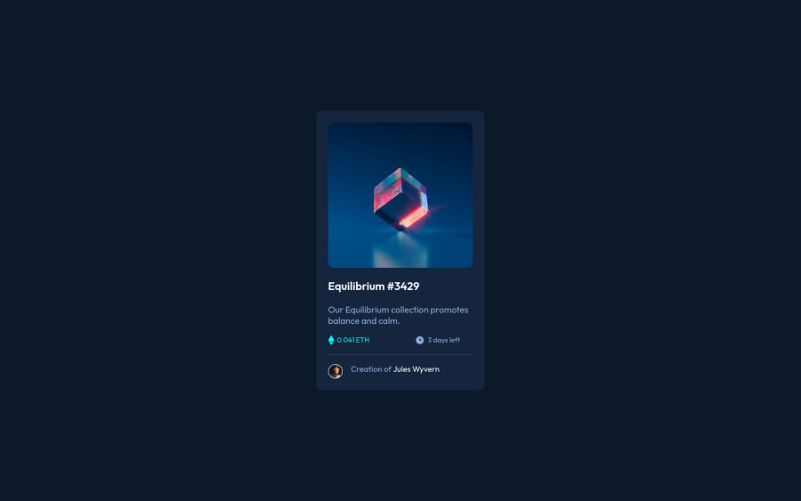
Design comparison
SolutionDesign
Solution retrospective
Hii front-end community,
Learned lots of things through making this project( and I thought I knew flex-box really well). Also, I tried to make my html a little more semantic. Any feedback about that is appreciated.
Thanks.
Community feedback
Please log in to post a comment
Log in with GitHubJoin our Discord community
Join thousands of Frontend Mentor community members taking the challenges, sharing resources, helping each other, and chatting about all things front-end!
Join our Discord
