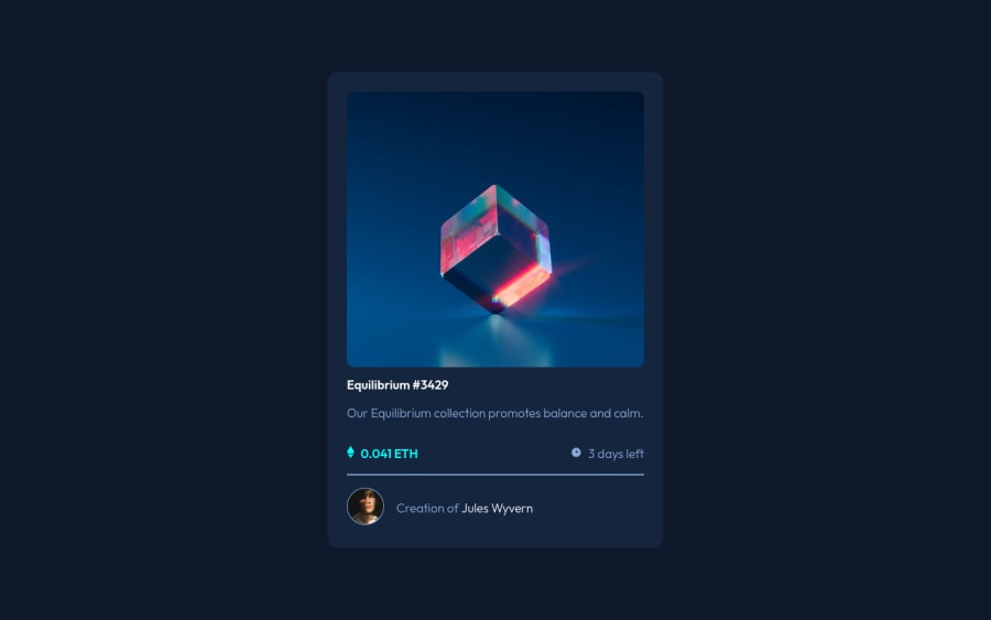
Design comparison
Solution retrospective
I had trouble with the overflow of the hover effect on the image. It still doesn't look perfect. You can see it when you use mobile emulation and click the image or when you zoom in large enough on desktop. Any advice / insights / explanations of that problem is more than welcome, together with suggestions for possible accesibility improvements.
Community feedback
- @vytkuklysPosted about 2 years ago
Hey Emmiecodes 👋,
It is a nice solution you have written!
I liked your code, too. I have noticed that you do not follow a css naming convention, though (like BEM). Which in your defense is understandable given the scope of the project. Yet making a habit out of it could pay dividents in the long run.
Other than that, keep up the good work! 🙂
Marked as helpful1@EmmiecodesPosted about 2 years ago@vytkuklys Thank you for your comment and suggestion. I have noticed myself too when writing the code that it feels a bit all over the place sometimes. I have been wanting to look into SASS or BEM more to make it look better organized but have not done so yet.
1
Please log in to post a comment
Log in with GitHubJoin our Discord community
Join thousands of Frontend Mentor community members taking the challenges, sharing resources, helping each other, and chatting about all things front-end!
Join our Discord
