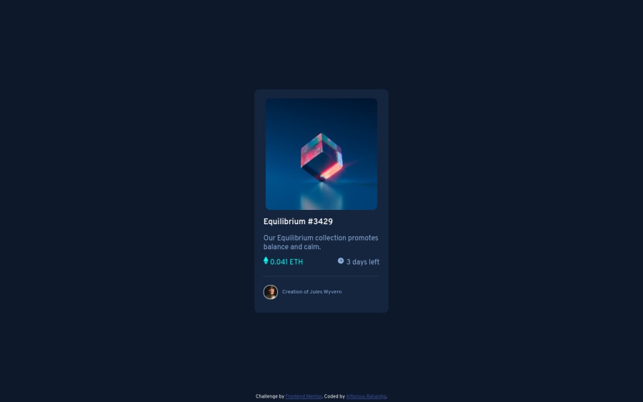
Design comparison
Solution retrospective
I wanted to use display: flex / grid for the elements below the nft-image, but had trouble doing that. Is it because of the div placements? I'd appreciate any feedback.
Community feedback
- @imadvvPosted over 2 years ago
Greetings alfiekadalfie! Congratulations on completing this challenge!, the are many ways to archive like this overlay, one way of them is to use css pseudo-elements so you can do something like this,
.nft {
  background-color: hsl(178, 100%, 50%);
  display: flex;
  align-items: center;
  justify-content: center;
  border-radius: 10px;
  position: relative;
  z-index: 1;
}
.nft::after {
  content: "";
  position: absolute;
  inset: 0;
  background-image: url(./images/icon-view.svg);
  background-repeat: no-repeat;
  background-position: center center;
  z-index: -1;
  transition: all 300ms ease-in-out;
}
.nft-image {
  max-width: 100%;
  border-radius: 10px;
  cursor: pointer;
  opacity: 1;
  transition: all 300ms ease-in-out;
}

.nft-image:hover {
  opacity: 0.5;
}

.nft-image:hover .nft::after {
  visibility: visible;
  opacity: 1;
}
and add some
paddingto.cardand removemarginfrom.nft-image..card { padding: 1rem; }Happy coding and keep up the good work 👍
Marked as helpful0 - @mubizzyPosted over 2 years ago
Excellent job on this challenge! your report has a few issues though:
- wrap everything in your body in
<main>or use semantics
2. it is a best practice to use both HTML 5 and ARIA landmarks to ensure all content is contained within a navigational region.
Hope it helps:)...don't forget to mark it as helpful 👍
You can get more details here...click here
0 - wrap everything in your body in
Please log in to post a comment
Log in with GitHubJoin our Discord community
Join thousands of Frontend Mentor community members taking the challenges, sharing resources, helping each other, and chatting about all things front-end!
Join our Discord
