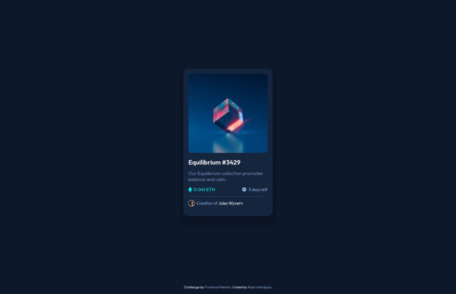
NFT Preview Component using HTML & CSS Flexbox
Design comparison
Solution retrospective
Please let me know your opinion on my challenge. Thank you!
Community feedback
- @denieldenPosted over 2 years ago
Hi Ryan, I took some time to look at your solution and you did a great job!
You can add the effect
:hovercreating adivthat appears on hover. I used tailwind but you can still see and understand which css properties you can use to do the same. Look here -> my solutionAlso instead of using
pxtry to use relative units of measurement -> read hereOverall you did well :)
Hope this help and happy coding!
Marked as helpful0 - @Andrew-CastroPosted over 2 years ago
Hey Ryan,
Great job so far. If you set the card width to 350px your solution gets very close to the design.
As Old mentioned above, there's a bit of heading misuse here. I don't personally believe the eth value, days left or author text are semantically headings and shouldn't be treated as such. You could use paragraph tags here.
Marked as helpful0 - Account deleted
Hello there! 👋
Congratulations on finishing your challenge! 🎉
I have some feedback on this solution:
-
Always Use Semantic HTML instead of
divlike<main><header><footer>, etc for more info -
Consider using the h1 element as a top-level heading only (all h1 elements are treated as top-level headings by many screen readers and other tools) like for example use h1 first then h2 etc. i hope this is helpful and goodluck!
Marked as helpful0 -
Please log in to post a comment
Log in with GitHubJoin our Discord community
Join thousands of Frontend Mentor community members taking the challenges, sharing resources, helping each other, and chatting about all things front-end!
Join our Discord
