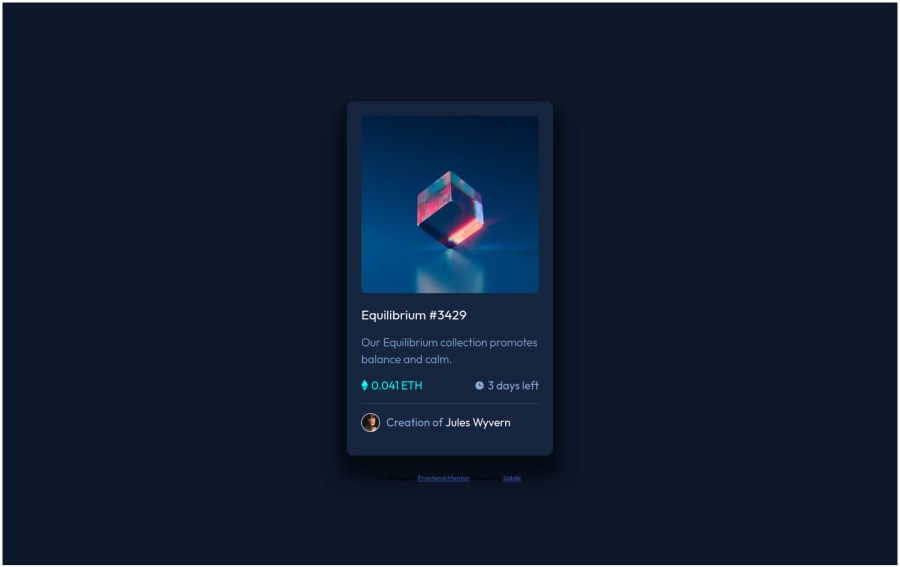
Design comparison
Solution retrospective
Constructive Feedback is welcomed
Community feedback
- @AdrianoEscarabotePosted almost 2 years ago
Hello Siddik L, how are you? I truly loved your project's outcome, however I have some advice that I hope you'll find useful:
to remove the scrollbar we can do this:
.container {
    padding: 0.2em;
}
To improve the responsiveness of the project, we can do this:
.card {
    max-width: 330px;
}
Instead of using "width" to specify an absolute width, use "max-width" to specify a maximum instead. By doing this, the content will behave much more amiably in smaller resolutions, making it easier to make the project responsive.
The remainder is excellent.
I hope it's useful. 👍
0@SiddiksidPosted almost 2 years ago@AdrianoEscarabote thanks for your tips ,I will keep it in mind next time
1
Please log in to post a comment
Log in with GitHubJoin our Discord community
Join thousands of Frontend Mentor community members taking the challenges, sharing resources, helping each other, and chatting about all things front-end!
Join our Discord
