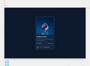
Design comparison
Solution retrospective
Apart from using semantic elements, what makes my code more accessible?
Community feedback
- @vanzasetiaPosted over 2 years ago
Hello, Alberta! 👋
I have some feedback on this solution:
- You need to wrap all the elements that have interactivity with interactive elements like anchor tag.
- I would recommend creating the overlay of the Equilibrium image with pure CSS. You can achieve that by using pseudo-elements and background properties.
- There should not be text in
spananddivalone whenever possible; instead wrap the text with a meaningful element like paragraph element. - I suggest all the file paths use forward slash instead of backslash. Consistency is the key for readability.
- Alternative text for images should not contain any words that related to image (e.g. picture, photo, logo, icon, graphic, avatar, etc). It's already an image element so the screen reader will pronounce it as an image.
- Alternative text also should not be hyphenated (like code).
- I highly suggest using either
remorpx(if you are not familiar withrem) instead of percentage unit forpadding,margin, and border properties because by using percentage unit, the result would always be different and it can cause issues on some screen sizes. Not only that, it is also because there are nomaxandminproperties for those properties (unlikewidthandheight) where you can limit them.
That's it! Hopefully, my feedback answers your question. 🙂
2@Ogbo0810Posted over 2 years ago@vanzasetia Thanks so much for the feedback. I'm still learning how to use the units appropriately. I will update my solution soon.
0 - @Sdann26Posted over 2 years ago
Hi Alberta!
The image has a height of 10% when in fact it should be 100%, that's why it comes out so small, I'm sure it was a small mistake when writing.
Also I think it would look much better if you add the following two attributes to the container:
border-radius: 3.5%; overflow: hidden;0@vanzasetiaPosted over 2 years ago@Sdann26 I would not recommend using a percentage unit for
border-radius. It can cause some issues on tiny screen sizes and wide screen sizes. On tiny screen sizes, theboder-radiuswould have a really small value and on large screen sizes, theborder-raidiuswould have a really big value.So, my recommendation is to use either
rem(recommended) oremorpx(not recommended).0@Sdann26Posted over 2 years ago@vanzasetia I also think the same thing however as I had already put a measure for the image before if I am not mistaken so that you do not modify your code too much I recommend you to do the same. Obviously using a relative measure like em is much better in my opinion.
0@vanzasetiaPosted over 2 years ago@Sdann26 It's best to write code with the expected result. A percentage unit is a relative unit that can result in unexpected behavior. So, it's best to use
remunit instead of percentage unit.Also, there's nothing changed. The
border-radiusis the same whether for desktop or mobile layout.0
Please log in to post a comment
Log in with GitHubJoin our Discord community
Join thousands of Frontend Mentor community members taking the challenges, sharing resources, helping each other, and chatting about all things front-end!
Join our Discord
