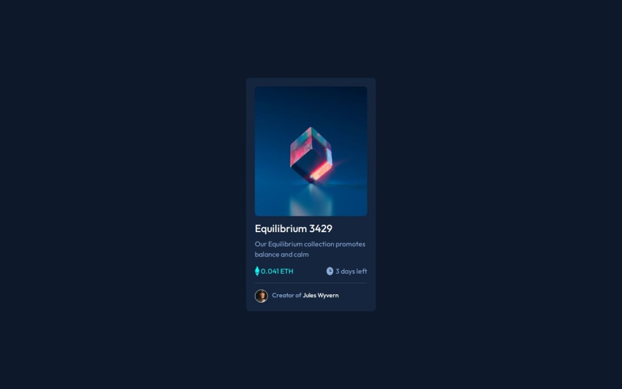
Design comparison
Solution retrospective
This is my fifth challenge and it's the fastest i have finished a challenge. i'm happy to keep improving. Please review my work and comment what i could have done better.
What challenges did you encounter, and how did you overcome them?I have previously tackled issues on previous challenges so this one wasn't too much to handle. Please review my work and comment what i could have done better.
Community feedback
- @ortalyartsPosted 8 months ago
Hello @j7st-ralph,
Nice job!
I've spotted some issues with the images:
-
The main image (and the two icons) appear deformed (don't have consist ratio). To solve this I would recommend to remove the specified image size in px and set for the image
max-width: 100%; height: auto;
This makes your image take the whole available width from its container and match the height automatically. -
Please note, it is still best practice for img tag to include width and height in html markup (provided in px). It is needed in order to avoid glitchy page jump, while the page is still loading. Because the browser doesn’t know how much space to "reserve" to each image on page until it calculates everything from css. This means, to make everything work properly, you have to provide width and height in html markup + in css (as described in no. 1. ) .
-
If your images are not just "decorative", consider to include descriptive alt tag, not just "image", to make your app accessible.
I hope you find this helpful. Cheers :)
0 -
Please log in to post a comment
Log in with GitHubJoin our Discord community
Join thousands of Frontend Mentor community members taking the challenges, sharing resources, helping each other, and chatting about all things front-end!
Join our Discord