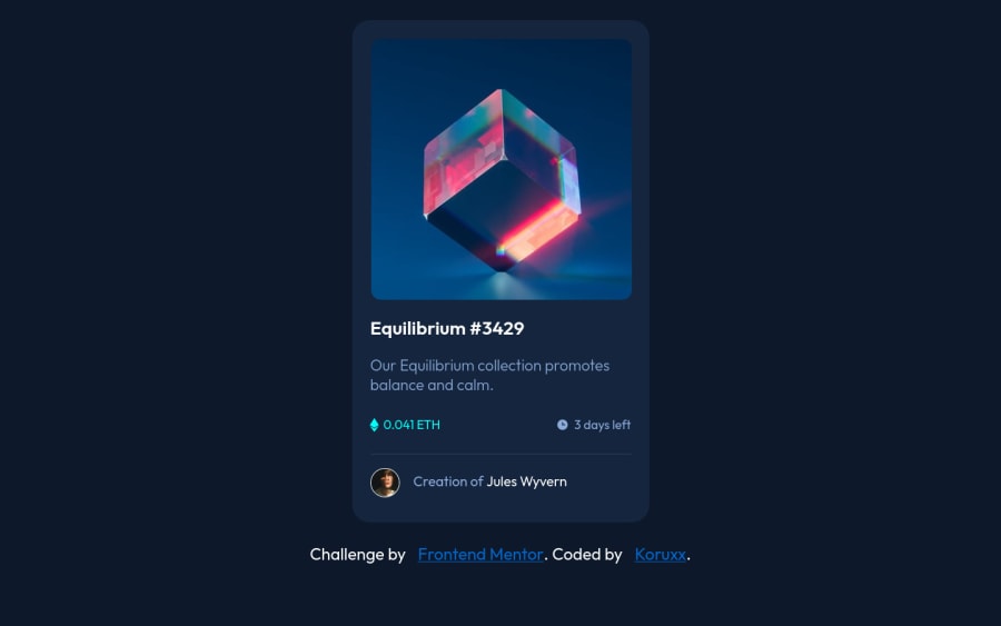
Design comparison
Solution retrospective
I had a rough time with this one... it took me more than 3 hours to complete. I spent most of that time trying to figure out how to create the interactive overlay for the image. I also don't understand why my image became was zoomed in whenever I converted it to a link... I could not figure it out and I eventually succumbed to the urge to submit so that I could see what others are doing. If anyone has any advice on how they did it, I'd love to hear!
Community feedback
- @Pulkit-s21Posted over 2 years ago
@Koruxx I saw your site and code and there are a lot of bugs in it.
- The card is stuck at one place and if you go below 1440px width then it slides off the screen. I think it might be because of fixed the width of the body. You really dont need to do that ever.
- You used
pxa lot which isnt good for the responsive behavior. Try using rem em for more responsiveness. - Never fix width with
widthand you don't need to doheight: auto.
Found errors but mostly they are of responsiveness so I suggest you watch Kevin Powell as he taught it very well in his courses and videos
Marked as helpful1@KoruxxPosted over 2 years ago@Pulkit-s21 thank you for taking the time to go through my code and help me. So basically, I should never assign the body a width because if I do, my middle-aligned container will slide off any screen smaller than what I assign the width. Also, I should use em because a px font looks different on each screen, dependant on pixel density?
0@Pulkit-s21Posted over 2 years ago@Koruxx yes if you assign a width to your body then the width wont change with the different screen sizes. If you don't assign it then its equal to the screen size that's why in the boilerplate we only assign
min-height: 100vhto the body so that it takes full vh and not is done about thewidth. Px is bad because you are fixing the size of the font or padding margin or anything else and wont be responsive to the text in the button or to the root element or to the screen size. I learned this from Kevin Powell that you must try as much as you can from using these fixed sizes units because they cause a lot of problems in responsiveness.Marked as helpful1 - @JetyunPosted over 2 years ago
in CSS
- Set the cube picture and container of the picture as position: relative.
- Set the icon view.svg as position: absolute.
- set the cube picture:active (to amend the condition of the picture when you clicked it to see the active state, not :hover) to opacity:0.5 which will make the cube picture 50% transparent when it is clicked so that you can view the icon view.svg behind the cube picture .
Additional: you can put background color on svg file, and padding which will position the eyes to the place you want
in HTML
- Put in the icon view.svg into the same container of the picture. Placed it the line before you put the cube picture in HTML so that they overlay with each other (make sure you do the step 1 and 2 in CSS for them to overlay).
Marked as helpful1@KoruxxPosted over 2 years ago@Jetyun so I want to align the two images and I want to stack the nft image on top of the eye image. Then I want to modify my eye svg to have a blue background. Then I want to modify the active state of the nft image to lower its opacity so that I can see the eye image behind it?
1
Please log in to post a comment
Log in with GitHubJoin our Discord community
Join thousands of Frontend Mentor community members taking the challenges, sharing resources, helping each other, and chatting about all things front-end!
Join our Discord
