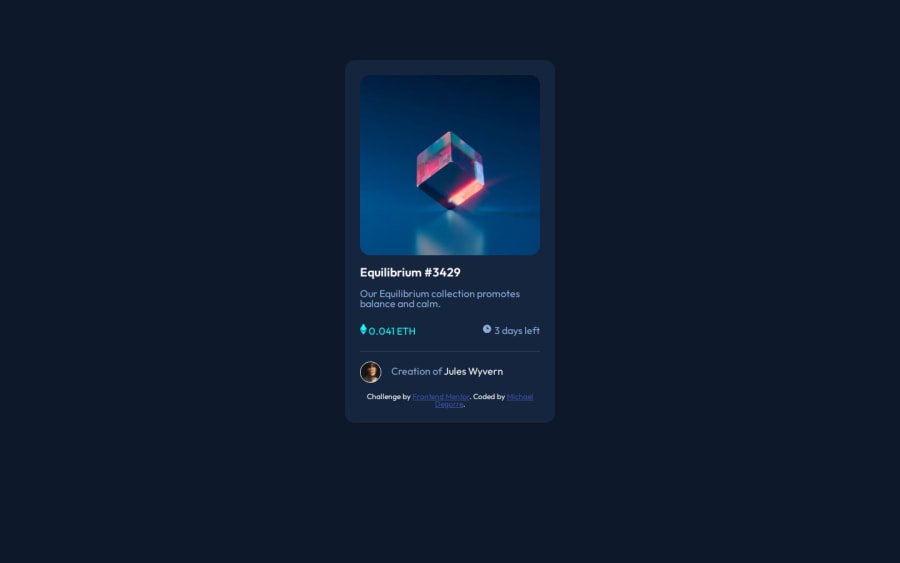
Design comparison
SolutionDesign
Solution retrospective
What challenges did you encounter, and how did you overcome them?
It was tough setting the background color on hover.
Community feedback
- @grace-snowPosted 7 months ago
Sorry to tell you this is missing all the essential interactive html elements and structure shown in the design.
If the design shows a hover style that means there should be an interactive element there. It's indicating something would be clickable. But you have no links in this.
Instead you have
- no
mainlandmark - an incorrect use of the
headerelement. There is nithibf appropriate for a header landmark in this design. - lots of misused section elements. This whole card could be one section, but not anything within it.
- misuse of the alt attribute (it should be empty on decorative images, or describe meaningful images).
- a footer inside the component that should be outside of main.
0 - no
Please log in to post a comment
Log in with GitHubJoin our Discord community
Join thousands of Frontend Mentor community members taking the challenges, sharing resources, helping each other, and chatting about all things front-end!
Join our Discord
