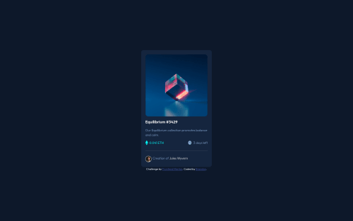
Submitted over 3 years agoA solution to the NFT preview card component challenge
NFT Preview Card with HTML/CSS
@oallelsefailo

Solution retrospective
I'm not sure if I did the text 'correctly' in terms of positioning. I used padding to try to line it up with the image but i'm not sure if there's a better way to ensure they are aligned.
I also feel like I used an excessive amount of classes..
The on hover for the main image was a bit of a challenge but I think it came out well.
Code
Loading...
Please log in to post a comment
Log in with GitHubCommunity feedback
No feedback yet. Be the first to give feedback on Brandon's solution.
Join our Discord community
Join thousands of Frontend Mentor community members taking the challenges, sharing resources, helping each other, and chatting about all things front-end!
Join our Discord