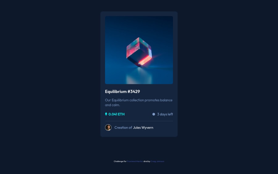
Design comparison
Solution retrospective
Any feedback is appreciated. 🙂
Community feedback
- @ApplePieGiraffePosted over 1 year ago
Hi, Craig Johnson! 👋
Nice job on this challenge! 👏 The card component looks great and so does your code! 👍
Just a small suggestion or two! 😉
Instead giving the card component a fixed width, I often find it a good practice to give a component such as that
width: 100%and then add a max-width to prevent it from becoming too wide. This way, the width of the component will adjust to the size of its container in the tablet/mobile layouts and avoid causing an overflow.You probably don't need to use
sectiontags inside the markup of the card sincesectiontags should always include a heading inside them to identify that section and the markup of the card is quite simple. I thinkdivtags should work just fine in this case. 🙂Hope this helps. 😊
Keep coding (and happy coding, too)! 😁
Marked as helpful1@craigdev937Posted over 1 year ago@ApplePieGiraffe - I've been trying to avoiding <div> soup. I now have a better understanding of the <section> tags. Thanks for your tips. 😉
1@ApplePieGiraffePosted over 1 year ago@indigomx9
No problem! 👍
Here's a great, in-depth article from CSS Tricks on semantic HTML elements and when and where to use them if you're interested in taking a look. 🙂 It's helped me learn a lot!
Marked as helpful1
Please log in to post a comment
Log in with GitHubJoin our Discord community
Join thousands of Frontend Mentor community members taking the challenges, sharing resources, helping each other, and chatting about all things front-end!
Join our Discord
