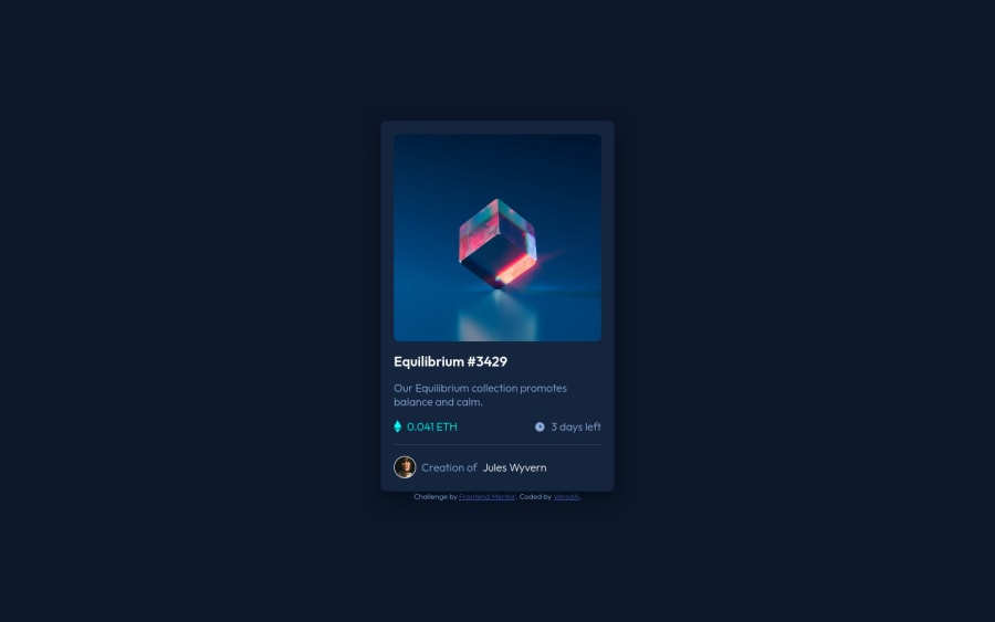
NFT Preview Card with flexbox and pseudo-element for overlay
Design comparison
Solution retrospective
My first challenge on frontend Mentor. I have tried to be as clean and smart as possible in the code and design using minimum of class.
Please feel free to give me some advice and feed back on it :)
Community feedback
- @PhoenixDev22Posted almost 3 years ago
Hello @BeLuxurious02 ,
I have some suggestions regarding your solution :
-
Within the body sits
main
for the body content andfooter
for the FM attribution. -
Anything with a hover style in a design means it's interactive, you need to add an interactive element
<a>
around the image ,Equilibrium #342
andJules Wyvern
. -
For any decorative images, each img tag should have empty
alt=""
andaria-hidden="true"
attributes to make all web assistive technologies such as screen reader ignore those images as in"./images/icon-ethereum.svg"
, ./images/icon-clock.svg"` . -
you can use an unordered list
class="card__info"
and in list item<li>
there would be<img>
and<p>
.
I would do for the avatar's part:
<div class="paragraph2 "> <img src="./images/image-avatar.png " class="author" alt="Avatar"> <p > Creation of <a href="#">Jules Wyvern</a></p> </div>
-
Don't use
span
ordiv
for meaningful content. -
Use
max-width
instead ofwidth
. Then a little margin on the component or padding on the body to stop it hitting screen edges. -
Never have font size in
px
. Usingpx
won't allow the user to control the font size based on their needs.
Hopefully this feedback helps.
Marked as helpful0 -
- @RioCantrePosted almost 3 years ago
Hello there! Nice work with this one. Looking at your solution, I would suggest the following for you...
- Wrap the content
container
with specific tag likemain
andattribution
withfooter
tag - Include
alt
with description in theimg
tags - Add
cursor:pointer
to the hover state of the fonts in design. Consider adding it with the.card_footer span
rule set - Add
border: 1px solid white;
andborder-radius: 50%;
in.card_footer img
rule set
Overall, you did good. Hope this helps and Keep up the good work!
Marked as helpful0 - Wrap the content
- @NaveenGumastePosted almost 3 years ago
Hay ! Cédric Good Job on challenge
These below mentioned tricks will help you remove any Accessibility Issues
-> Add Main tag after body
<main class="container"></main>
-> Always use the "alt attribute" and just leave it empty bt.. always add it with img tag.
-> Learn more on accessibility issues
Keep up the good work!
Marked as helpful0
Please log in to post a comment
Log in with GitHubJoin our Discord community
Join thousands of Frontend Mentor community members taking the challenges, sharing resources, helping each other, and chatting about all things front-end!
Join our Discord