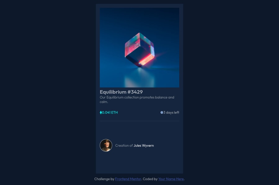


Design comparison

Solution retrospective
For this solution I had to follow a YouTube tutorial (https://www.youtube.com/watch?v=9bGbykdR4T8).
Just a few takeaways:
- { box-sizing: border-box; margin: 0; padding: 0; } why is the box-sizing property always set using the * selector?
@media (min-width: 500px) { .card { width: 450px; margin: 0 auto 1rem; }
/* body { display: flex; align-items: center; justify-content: center; } */ } I learned from this tutorial not use flexbox to center the card/container. Anybody agree/disagree?
Other questions: What other ways besides the background-image property can I render an image? I see many developer reset the margin and padding to 0? Why is that?
Biggest idea I got is centering the card/container. Media queries and building responsiveness remains an ongoing mystery. Thanks.
Community feedback
Please log in to post a comment
Log in with GitHub
Join our Discord community
Join thousands of Frontend Mentor community members taking the challenges, sharing resources, helping each other, and chatting about all things front-end!
Join our Discord