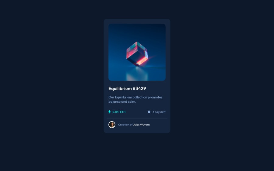
Design comparison
Solution retrospective
Any feedback on CSS and HTML structure is welcome. I'm trying to improve both so I can start using libraries and also Javascript.
Community feedback
- @BartyCodingPosted about 3 years ago
Hi naathcs, I took some time to look at your solution and you did a great job!
Also, I have some tips for improving your code:
-Remove the margin from the
containerclass and make the height100vhto truly center the card in the middle of the page. -For the hover effect on the image you could make use of pseudo-classes like::beforeto achieve the same effect. This will remove any extra clutter in your HTML. -For the decorative images like the clock and the Ethereum sign you should remove the alt text and add anaria-hidden="true"to make screen readers ignore this text as it doesn't serve much purpose. -You could also remove/comment out theattributionat the end as your not using it but it's still taking up space at the bottom for no reason. -You could also add a simple box-shadow to make it look a lot better. If you're unsure of how to do that then here's a great article about how they work. LinkOverall you did great :)
Hope this helps and happy coding!
Marked as helpful2@naathcsPosted about 3 years ago@BartyCoding
Thank you very much for your feedback!
I must admit that most of your tips I have never used before such as the "::before" pseudo-class and for sure will pay attention to use next time. I was reading about the aria and role usage but didn't feel like I knew enough to use it but I will definitely use it. I didn't think of a box shadow since the background was dark but will pay attention next time. And the attribution was a mistake (😅) I forgot to remove.
Again, thank you very much for your feedback!
1 - @Martin-K-KamirPosted about 3 years ago
Hey Nathalia, nice work! Everythings looks amazing and nicely done!
Only what i would fix is the card that is not very centered for smaller screens.
Also maybe for your next project try to use rem units not px.
Marked as helpful1@naathcsPosted about 3 years ago@Martin-K-Kamir thank you f our the feedback!
I’m going to use it. I feel a bit confused with rem unit but I’ll done research and start using it
0@Martin-K-KamirPosted about 3 years ago@naathcs
rem are relative units. They're relative to the font size of the root element. The main thing why rem is used is because when you zoom in/out page everything scale up. Not like pixels. Also there are more benefits.
This is really good article about to understand rem. https://www.sitepoint.com/understanding-and-using-rem-units-in-css/
Marked as helpful1 - @2divPosted about 3 years ago
Hi Nathalia, Congratulation completing the challenge. Your code is very good.
Marked as helpful0 - @jgengo-altPosted about 3 years ago
Hello there 👋
First of all, good job 🚀
I noticed few improvement possible 📋
-
In your
style.css, at the very bottom of the file you have empty rulesets, you should try as much as possible to avoid it. -
You didn't add any box-shadow to your card, I assume you forget, however box-shadow can be a bit tricky sometime, so don't hesitate to practice it when you have the occasion 🌱
-
Also, to be a bit picky, your card isn't vertically centered. It's not very important, but when for example opened with an iPad it can look a bit odd...
Once again, you did great! 🚀 Keep going 💪
Don't hesitate to follow me, I will follow back and make sure to give you feedbacks for your future post if you are interested 🦉
Marked as helpful0@naathcsPosted about 3 years ago@jgengo-alt
Thank you very much for the feedback! I'm definitely going to keep all your feedback and make sure to use it for my next challenge. I completely forgot about the box shadow and the rulesets (my bad 😅) and the vertical alignment I was having a bit of a difficult time trying to use flexbox and then ended up with a regular height.
Thank you again 😁
0 -
Please log in to post a comment
Log in with GitHubJoin our Discord community
Join thousands of Frontend Mentor community members taking the challenges, sharing resources, helping each other, and chatting about all things front-end!
Join our Discord
