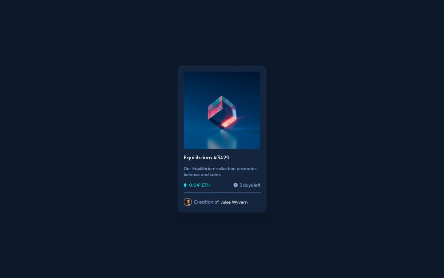
Design comparison
SolutionDesign
Solution retrospective
Making the icon appear on top of the photo with a cyan background and with a slight transparency really turned out to be way more difficult than I thought, could I have done it in a better way than this?
Community feedback
Please log in to post a comment
Log in with GitHubJoin our Discord community
Join thousands of Frontend Mentor community members taking the challenges, sharing resources, helping each other, and chatting about all things front-end!
Join our Discord
