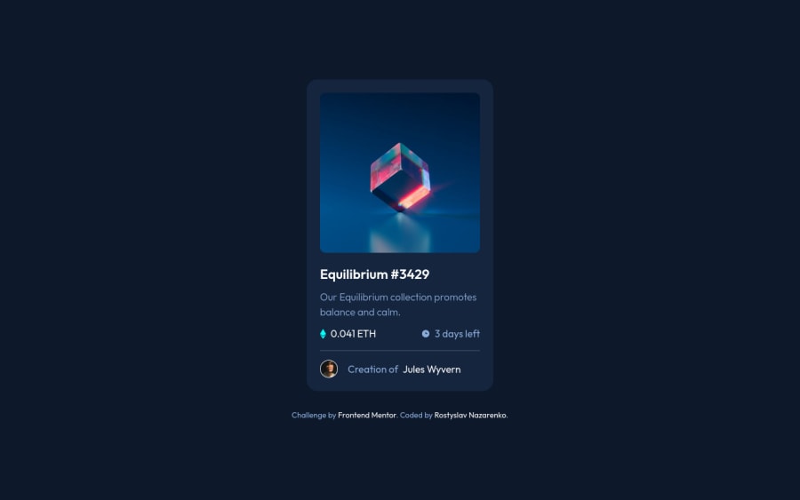
NFT preview card using HTML, CSS, Flexbox, transitions
Design comparison
Solution retrospective
Hello! I'd love your feedback 😁
- I had a few problems with doing the hover effect. I'm not sure how to do it properly if there's some other way to do this, please tell me.
- How do you name your classes? Do you use BEM? Did I use BEM right?
Community feedback
- @grace-snowPosted almost 2 years ago
You need to add an interactive element around that main image. What would you expect to happen on click? That will determine what element it should be and what the label should say.
In your hrefs on these mock projects don't add
!#
as that's just an invalid link. Instead usehref="/"
so the page would reload on clickMarked as helpful1@rostyslav-nazarenkoPosted almost 2 years ago@grace-snow Thank you, Grace!
I will think about an interactive element. I thought to wrap in an
a
element and display it as a block element, but I don't know whether this is a great solution.0@grace-snowPosted almost 2 years ago@rostyslav-nazarenko it depends what you think would happen on click. You'd use an anchor tag only if you expected it to navigate somewhere. And that would have to communicated in the labelling text for that link.
1 - @asekabtwPosted almost 2 years ago
Hey Rostyslav, great jobbb))) I made hover effect like you, but a little bit different:
- I made it all together in :after element. I set to the background-image icon svg. And I put the background-color in :after element. So when i hovered to that image I changed only opacity from 0 to 1.
- Name classes on their own. If you think the div with class will have it's elements, name without parent-name. For example: Create a div with class card. Inside this card you can create elements like card__title, card__description and etc. And within this card class you can create a div with class "image". And name it's elements like image__item, image__title, etc. You don't need to name everything like their parent element. Block element modifier. Just create a block and inside of this block it's element. Also you can create more block inside of that block.
I really tried my best to explain to you. I hope I helped you a little. Keep doin' I wish you the best!
Marked as helpful1@rostyslav-nazarenkoPosted almost 2 years ago@asekabtw Thank you for your feedback!
- I tried at first as you said but then I get stuck with the centering element and many other issues. I probably solved them later on but decided to keep the icon in HTML.
- Naming will never be easy 😅 I mean with time it will
Have a great day!
0 - @BernardusPHPosted almost 2 years ago
Hello ROSTYSLAV NAZARENKO. I was the same with the hover effect. Check W3Schools for an example of the hover effect that I also used.
For the class naming sense. Well I use something similar to BEM but a little less creative since I suck at naming things and I hate
tailwind length
classes so I go mostly by one or two names per element unless JS is involved. But I like your class naming sense because it is not to long and it explains perfectly what it is.Marked as helpful1@rostyslav-nazarenkoPosted almost 2 years ago@BernardusPH Hi! Thank you for your feedback
I actually used W3School's example in my solution 😁 I wasn't sure about the icon.
I probably suck at creativity, so I know what you mean 😅
Have a wonderful day!
1
Please log in to post a comment
Log in with GitHubJoin our Discord community
Join thousands of Frontend Mentor community members taking the challenges, sharing resources, helping each other, and chatting about all things front-end!
Join our Discord