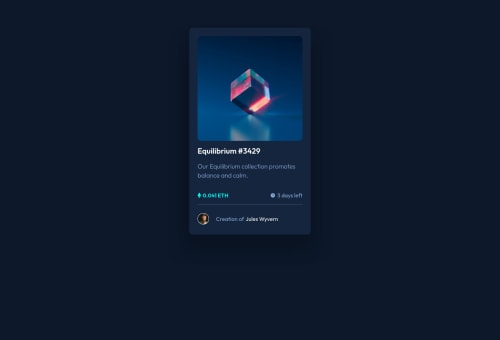
Submitted about 4 years agoA solution to the NFT preview card component challenge
NFT preview card using HTML and CSS
@grmbyrn

Solution retrospective
Is there anything in this project that could be improved? Finding out how to put an overlay over the image was quite difficult so I hope that looks good.
Code
Loading...
Please log in to post a comment
Log in with GitHubCommunity feedback
No feedback yet. Be the first to give feedback on Graeme Byrne's solution.
Join our Discord community
Join thousands of Frontend Mentor community members taking the challenges, sharing resources, helping each other, and chatting about all things front-end!
Join our Discord