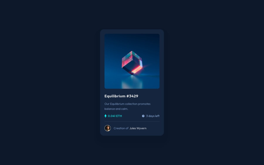
Not Found
Not Found
Not Found
Not Found
Not Found
Not Found
Not Found
Not Found
Not Found
Not Found
Not Found
Not Found
Not Found
Not Found
Not Found
Not Found
Not Found
Not Found
Not Found
Not Found

Submitted

NFT Preview Card using HTML and CSS

nachtwurstโ€ข 40

@nachtwurst

Desktop design screenshot for the NFT preview card component coding challenge

This is a solution for...

  • HTML
  • CSS
1newbie
View challenge

Design comparison


SolutionDesign

Solution retrospective


I found stacking elements in order to get a hover-over transparency effect difficult. It took me a while to figure out the relative and absolute positioning stuff. This one felt far better to me than my last challenge, though.

I'm not certain about my font size between desktop and mobile. How much should you change font size between platforms, if at all? Thank you for any feedback.

Community feedback

Account Deleted

The standard font-size in a paragraph especially on mobile & desktop is 16px for the list is between 12px to 14px and for the headings between 18px to 30px but all the sizes I mentioned is really depends to the website you're currently building and the more projects you're building it will come to you naturally what font-size you should to used... in most cases the UI Designer is the responsible for the font-size. you should not to worry since you're Aspirant front-end Web Developer

Marked as helpful

2
Lucas ๐Ÿ‘พโ€ข 104,420

@correlucas

Posted

๐Ÿ‘พHello @nachtwurst, Congratulations on completing this challenge!

I saw your solution preview site and I think it's already really good. Hereโ€™s some tips for you to improve it:

1.Add transitions to make the interaction smoother while the element gets hovered, you can use a value like transition: all ease-in 0.5s.

2.To improve your component overall responsiveness, something you can do its to create a media query to save space in the pricing section to make each information in a different row. Hereโ€™s the code for this media query.

@media (max-width: 350px) {
.price_and_timer {
    width: 100%;
    display: flex;
    flex-direction: column;
    justify-content: space-between;
    font-family: 'Outfit', sans-serif;
    align-items: center;
}
}

โœŒ๏ธ I hope this helps you and happy coding!

Marked as helpful

1
Vanza Setiaโ€ข 27,795

@vanzasetia

Posted

Hello there! ๐Ÿ‘‹

Congratulations on finishing this challenge! ๐Ÿ‘

About the font size for this challenge, the font size for the text content on both desktop and mobile designs is the same. This is just my assumption. But, by thinking like this, you can make the site responsive without any media queries.

To make the site responsive without media queries, you only need to find a way to make the card responsive. To do that, you only need to set a max-width on the card element. There's no need for min-width and width. Let the card shrink if it is ever needed.

Remove width and height from the body. Never use 100vw on anything as it doesn't account for scrollbars when present. It may only ever introduce potential overflow/scroll bugs.

That's it! I hope you find this useful! ๐Ÿ™‚

Marked as helpful

1
Elaineโ€ข 11,400

@elaineleung

Posted

Hi nachtwurst (like, a night wurst? is there a morgenwurst?)! First off, great job in figuring out absolute positioning, which isn't easy at all for many when they first encounter it. I see that you used it for both the overlay and also the eye icon, which is a good start! For the eye, you may not need to use position: absolute; instead, try adding display:grid to the overlay since it's the parent container of the icon and can thus help with the centering, and then center the eye using place-content: center on the parent container, like this:

.cyan_square {
   display: grid;
   place-content: center;
   // rest of your code
}

.view_icon {
  // remove all positioning properties
}

About your question on font sizes, generally you wouldn't want to go lower than 15px for the body font size for mobile view, and for large desktop views, sometimes it's common to see even 18px for the body font size. But regardless what is used, I think it's best to use rem instead of pixels when writing the CSS (where 1rem by default is 16px unless it is changed in the html selector). This can be a bit of a nuisance when you need to convert units, but there are ways around it, and in the end, using relative units is much better for accessibility when users aren't locked in to pixel units, which they can't really change.

Anyway, great job on the whole, and hope this helps you out a bit!

Marked as helpful

1

nachtwurstโ€ข 40

@nachtwurst

Posted

@elaineleung Thank you for the detailed feedback! I will definitely play around with display:grid and see if I can get it figured out. Some of the positioning stuff is still hard to visualize in my head, but I assume it will become more intuitive with practice. Anyway, thanks again!

0

Please log in to post a comment

Log in with GitHub
Discord logo

Join our Discord community

Join thousands of Frontend Mentor community members taking the challenges, sharing resources, helping each other, and chatting about all things front-end!

Join our Discord