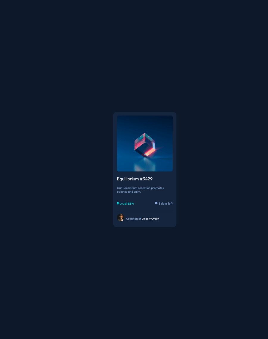
Design comparison
Community feedback
- @denieldenPosted over 2 years ago
Hello Adegbenro, You have done a good work! 😁
Some little tips to improve your code:
- add
maintag and wrap the card for improve the Accessibility - remove all
marginfrom.headerclass - use flexbox to the body to center the card. Read here -> best flex guide
- after, add
min-height: 100vh and margin: 0to body because Flexbox aligns child items to the size of the parent container - add
transitionon the element with hover effect - instead of using
pxuse relative units of measurement likerem-> read here - Using
<hr>for the line is not the best way because this tag have a semantic meaning... in this case use div withborder-bottombecause this line is decorative
Keep learning how to code with your amazing solutions to challenges.
Hope this help 😉 and Happy coding!
Marked as helpful0 - add
- @Mohit-k-MummonPosted over 2 years ago
Hey congrats on completing the project! Some advice
-
Ensure your body takes the entirety of the viewport. I suggest setting the min-height to 100vh
-
I assume the margin 600px on the .header class was for centering the component. A better approach would be using display flex on the body and justify-content and align-items to center.
-
You used an h3 for the header and then an h5 for the next heading. It is best practice to move in increments of 1, so go from h3 -> h4 -> h5.
-
It is best practice to use landmark elements, so for the div with the class header. Try using main or section instead. You can read more about landmark elements here Here
Here is an example, also remove the margin from the .header class
body{
    background-color: hsl(217, 54%, 11%);
    min-height: 100vh;
    display: flex;
    justify-content: center;
    align-items: center;
}

.header{
    background-color: hsl(216, 50%, 16%);
    width: fit-content;
    padding: 20px;
    border-radius: 20px;
}
Marked as helpful0 -
- @correlucasPosted over 2 years ago
👾Hi @alinco6426, congratulations on your solution!👋 Welcome to the Frontend Mentor Coding Community!
Great solution and a great start! From what I saw you’re on the right track. I’ve few suggestions for you that you can consider adding to your code:
1.Use
<main>instead of a simple<div>this way you improve the semantics and accessibility showing which is the main block of content on this page. Remember that every page should have a<main>block and that<div>doesn't have any semantic meaning.2.The main heading has the tag
<h3>, in this case, you should replace it with<h1>since this heading is the main title on this page. Remember that every page should have one<h1>to declare which is the most important title and that you should follow the hierarchy using the heading sequence(h1, h2, h3, h4, h5)and never jump a level.3.Add the website favicon inserting the svg image inside the
<head>.<link rel="icon" type="image/x-icon" href="./images/favicon-32x32.png">4.Fix the alignment. The best way make this alignment is by using
FLEXBOX. The first step, is to addmin-height: 100vhto make the body height size becomes 100% of the viewport height, this way you make sure the container will be aligned vertically since thebodywill display ever 100% of the screen height. After that add two flex properties to make the alignmentdisplay: flex/align-items: center;/justify-content: center;. If you're using the attribution you need to addflex-direction: columnto make the attribution stays under the QR Code component.✌️ I hope this helps you and happy coding!
0
Please log in to post a comment
Log in with GitHubJoin our Discord community
Join thousands of Frontend Mentor community members taking the challenges, sharing resources, helping each other, and chatting about all things front-end!
Join our Discord
