Design comparison
Solution retrospective
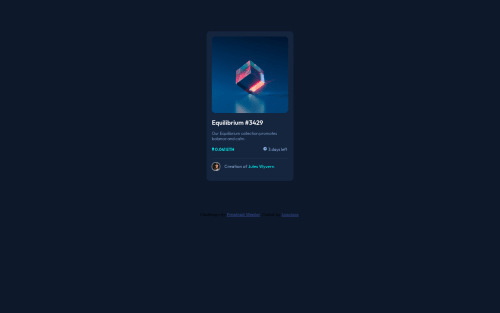
Hello Community, This is another project I completed, I would very much appreciate honest feedbacks and corrections. THANK YOU ALL.
Community feedback
- @Dan-KantPosted over 2 years ago
Hello dude, the implementation is great, but the thing you lack in is hover effects. Couldn't you manage to write hover effects or you just didn't want to ?
Marked as helpful0@Luscious258Posted over 2 years ago@Dan-Kant Thanks for you feedback Dan, I really appreciate it. I actually forgot to write the hover effects. I will now that you pointed it out..... Thanks a lot.
0 - @Dust1100010Posted over 2 years ago
Congratulations for complete the challenge! You forgot the hover part, check on the desings file and i recommend you center the container ✌
For example for the header part "Equilibrium #3429"
h1:hover { cursor: pointer; color: var(--cyan); }
color: var(--cyan); or the color code
Marked as helpful0@Luscious258Posted over 2 years ago@Dust1100010 Hey, Thanks a lot for your feedback. I will make the necessary corrections on the code.. Thanks a lot.
0
Please log in to post a comment
Log in with GitHubJoin our Discord community
Join thousands of Frontend Mentor community members taking the challenges, sharing resources, helping each other, and chatting about all things front-end!
Join our Discord