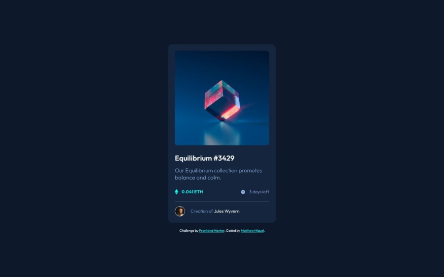
Design comparison
SolutionDesign
Solution retrospective
What are you most proud of, and what would you do differently next time?
Figuring out how to overlay icon and color over the image
What challenges did you encounter, and how did you overcome them?Was difficult to figure out the active state for the big image. but some googling helped to piece together a solution
What specific areas of your project would you like help with?any feedback on the html or css code is welcomed. Is there anything I could have written/structured better? Is there an easier way to do the image's active state?
Community feedback
- @marcfrancissPosted 4 months ago
Impressive solution to this challenge! 💯 Specially on using semantic html structure.
A little added info would be to add 'position: relative' to your 'section.mainimg' so that the '.overlay' will follow its position.
section.mainimg {
   position: relative;
}

.overlay {
   position: absolute;
   width: 100%;       // same width
   height: 100%;      // and height as .mainimg
   top: 0;       // same position as .mainimg
   left: 0;
   border-radius: 0.4rem;
   background-color: rgb(0, 255, 247, 50%);
   opacity: 0;
Keep coding great solutions!
Marked as helpful0
Please log in to post a comment
Log in with GitHubJoin our Discord community
Join thousands of Frontend Mentor community members taking the challenges, sharing resources, helping each other, and chatting about all things front-end!
Join our Discord
