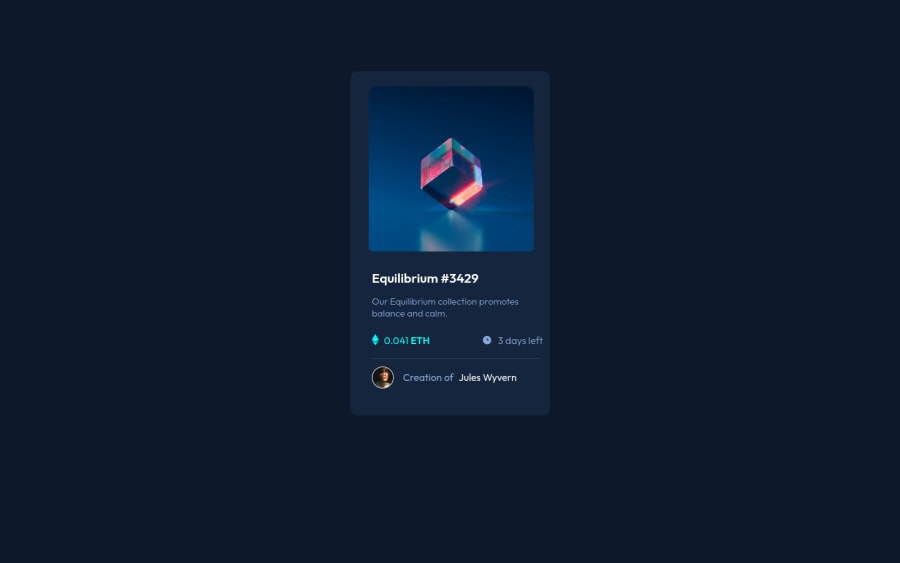
Design comparison
Solution retrospective
I thought that the image hover effect was the most difficult thing about this challenge. If you view my code, would you recommend a different approach or do you think it's okay as it is?
Community feedback
- @HassiaiPosted over 1 year ago
To center .card on the page using flexbox, replace the height in the body with min-height: 100vh.
For a responsive content, there is no need for the height in .card and replace its width with
max-widthUse relative units like rem or em as unit for the padding, margin, width values and preferably rem for the font-size values, instead of using px which is an absolute unit. For more on CSS units Click here
Hope am helpful.
Well done for completing this challenge. HAPPY CODING
Marked as helpful2@kxtaraPosted over 1 year ago@Hassiai Thank you for giving me feedback on this challenge it is really helpful. Happy coding!
0
Please log in to post a comment
Log in with GitHubJoin our Discord community
Join thousands of Frontend Mentor community members taking the challenges, sharing resources, helping each other, and chatting about all things front-end!
Join our Discord
