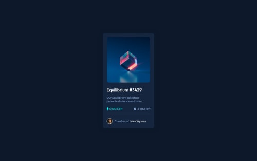
Design comparison
Solution retrospective
It was a bit hard for me the inside components alignment, what do you think about?
Community feedback
- @DrMESAZIMPosted almost 3 years ago
hi @RikkaaDev I had the opportunity to read your code .I believe its good work , well done especially on the commenting in the CSS file
Marked as helpful1 - @PhoenixDev22Posted almost 3 years ago
Hello @RikkaaDev,
I have some suggestions regarding your solution:
-
Anything with a hover style in a design means it's interactive. you need to add an interactive element around the image.
-
never use
span
for meaningful content. It would be better `
<p class="credits">Creation of <a href="#">Jules Wyvern</a></p>
-
For any decorative images, each
img
tag should have emptyalt=""
andaria-hidden="true"
attributes to make all web assistive technologies such as screen reader ignore those images inalt="eth-icon" alt="clock-icon">
-
the link should be wrapping the original image and either have
Sr-only
text, anaria-label
oralt
text that says where that link takes you. -
The avatar's alt text shouldn't be
alt="profile-pic"
. You can useJules Wyvern
as an alt text. -
better to use
min-height: 100vh;
to the.container
, usingvh
(viewport height) units to allow the body to set a minimum height value based upon the full height of the viewport.
Overall , your solution is good , Hopefully this feedback helps.
Marked as helpful0@devsimocastlesPosted almost 3 years ago@PhoenixDev22 I need to study HTML accesibility I guess, thanks for the feedback!
1 -
Please log in to post a comment
Log in with GitHubJoin our Discord community
Join thousands of Frontend Mentor community members taking the challenges, sharing resources, helping each other, and chatting about all things front-end!
Join our Discord