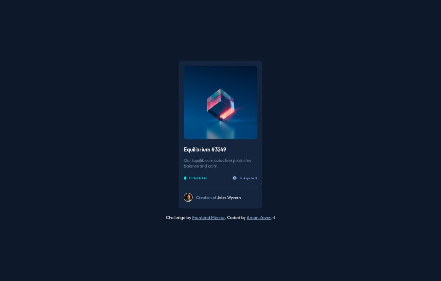
Design comparison
Solution retrospective
This project was really interesting as it forced me to have multiple parts. However, I would love to know if the divs I used were in the correct form. Is there a more efficient way to use the divs in order to section out the project? Thanks in advance :)
Community feedback
- @vanzasetiaPosted over 2 years ago
Hello, Aman! 👋
Good effort on this challenge! 👍
I notice that you are using
divandspanfor almost everything. Why don't use heading tags or any other semantic tags? From an accessibility perspective, of course, this causes a serious problem because now the screen reader users won't be able to differentiate between the title, paragraph, and links. For them, everything is just a text, the same thing.Also, I would suggest learning how to write a good alternative text for images. One tip that I would recommend starting to follow is that alternative text for images should not contain any words that related to image (e.g. picture, photo, logo, icon, graphic, avatar, etc). It's already an image element so the screen reader will pronounce it as an image.
That's it! Hope this feedback helps! Happy coding! 😁
Marked as helpful1@Aman-ZaveriPosted over 2 years ago@vanzasetia Thanks so much! I'll definitely keep that in mind for future projects :)
0
Please log in to post a comment
Log in with GitHubJoin our Discord community
Join thousands of Frontend Mentor community members taking the challenges, sharing resources, helping each other, and chatting about all things front-end!
Join our Discord
