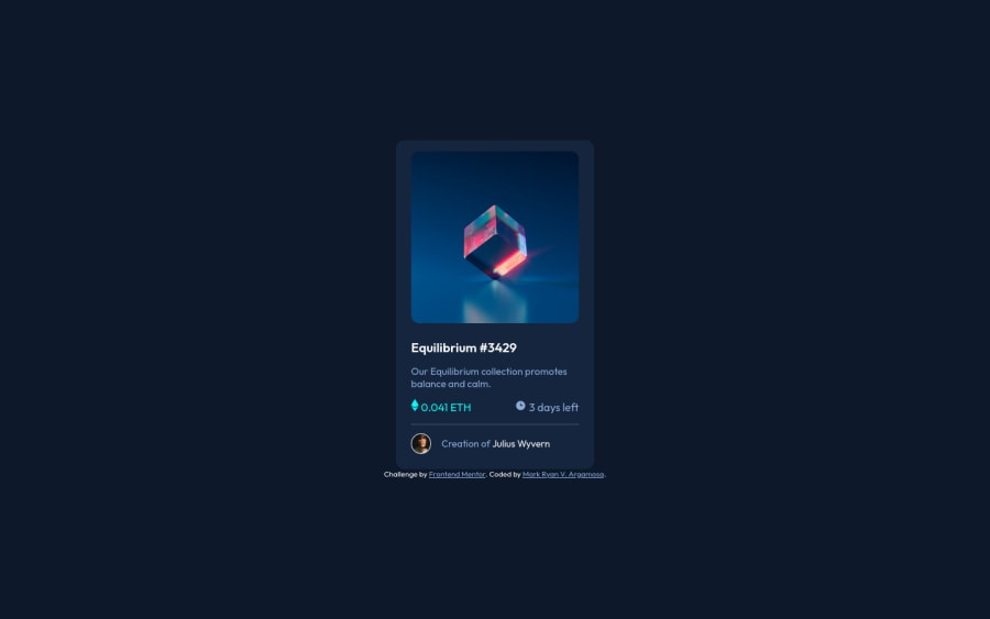
Design comparison
Solution retrospective
Don't know how to center the ethereum icon and the price, also the clock icon and days remaining.
Community feedback
- @PhoenixDev22Posted about 2 years ago
Hi MakiRyan,
Congratulation on finishing this challenge. Great job on this one! I have few suggestions regarding your solution:
HTML
- You should use
<main>landmark for the NFT card and<footer>for the attribution as landmarks allow screen reader users to navigate through sections of your website by skipping to content that interests them. Landmarks could be seen as the logical layout of the website's UI, which is divided into e.g. header, navigation, main content, and footer. So the usage makes sense in any case.
- The most important part in this challenge interactive elements. Since there's a :hover state on the image and means it's interactive, So there should be an interactive element around it. When you create a component that could be interacted with a user , always remember to include interactive elements like(button, textarea,input, ..)
for this imagine what would happen when you click on the image, there are two possible ways:
1: If clicking the image would show a popup where the user can see the full NFT, here you use
<button>.2:If clicking the image would navigate the user to another page to see the NFT, here you can use
<a>. You should have used<a>to wrapEquilibrium #3429andJules Wyverntoo.- The link wrapping the equilibrium image should either have
Sr-onlytext, anaria-labeloralttext that says where that link takes you.
- For any decorative images, each img tag should have empty
alt=""and addaria-hidden="true"attributes to make all web assistive technologies such as screen reader ignore those images inicon-clock, icon-ethereum.
- Profile images like that avatar are valuable content. The alternate text should not be empty. You can use the creator's name
Jules Wyvern. Read more how to write an alt text .
- If you wish to draw a horizontal line, you should do so using appropriate CSS. You may remove the
<hr>, you can useborder-top:to the avatar's part.
- The hover effect is missing. There are so many ways to do the hover effect on the image, The one I would use is pseudo elements
::before, ::after. You can use pseudo-elements to change the teal background color to hsla. Then the opacity can be changed from 0 to 1 on the pseudo element on the hover. Also using pseudo elements makes your HTML more cleaner as there's no need for extra clutter in the HTML.
- You should remove
<mark>tag which defines text that should be marked or highlighted.
- Adding
rel="noopener"orrel="noreferrer"totarget="_blank"links. When you link to a page on another site usingtarget=”_blank”attribute, you can expose your site to performance and security issues.
- Include a git ignore. This came with your starter files is extremely important as you move onto larger projects with build steps.
- Remember a modern css reset on every project that make all browsers display elements the same.
Overall, your solution looks great. Hopefully this feedback helps.
Marked as helpful0@MakiRyanPosted about 2 years ago@PhoenixDev22 Thank you for your feedback! This will help me on improving. 💯
1 - You should use
- @Md-Raihan-AlamPosted about 2 years ago
how about this way.. you keep the Ethereum icon and the price in one div, make use of the flex/grid(whichever you prefer) on that div and use justify-content start and align-items center. you can make it center, same for clock icon and days remaining. This is I do my things when things come to like this...
Marked as helpful0@MakiRyanPosted about 2 years ago@Md-Raihan-Alam i will try this. Thank you for your feedback!
0
Please log in to post a comment
Log in with GitHubJoin our Discord community
Join thousands of Frontend Mentor community members taking the challenges, sharing resources, helping each other, and chatting about all things front-end!
Join our Discord
