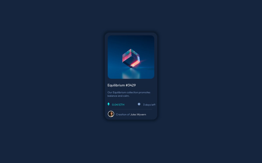
Design comparison
Solution retrospective
This is my first project and spent about a day figuring this out. my question is what problems do you see in my code and on what things should i focus? i am lacking at understanding position tab and i feel like i just used same thing everywhere? feel free to give any opinion. thank you in advance.
Community feedback
- @darryncodesPosted almost 3 years ago
Hi Aviraj.
You've done well here to get all the elements in the design correct - i think with a few tweaks it could be perfect!
- your box-shadow feels a little harsh in my view, a generator could be a really helpful tool to soften the shadow a little
- I think your card is missing
cursor: pointer;
- i'd encourage you to review your accessibility report and fix the errors, they all seem to be to do with semantics and headings
As the others have said you should look to conquer flexbox and grid, it'll make your life a lot easier instead of using absolute position and is a modern way to create responsive designs.
Here are some really useful resources:
- A Complete Guide to Flexbox - css tricks
- Learn Flexbox for free - Scrimba
- A Complete Guide to Grid - css tricks
- Responsive Web Design - freeCodeCamp
Good work and keep coding!
1 - @LshirocPosted almost 3 years ago
Hi, I took a look your code and couldn't find CSS Flexbox and Grid. If you want to create responsive layouts (in this challange they don't require any responsive design if I'm not mistaken). And also it becomes so easy to create the ethereum and time part in the challange with flexbox. For example for this you should define the direction( row or column) and the you can separate them with just one line code. So, I advise you to learn flexbox and grid. But recent result is also good although you don't know flexbox and grid :). Have a good day
1@avirajwalunjPosted almost 3 years ago@Lshiroc Thank you zeynal for taking out time and giving this comment will surely learn grid and flex.
0 - @rsrclabPosted almost 3 years ago
Hi, @avirajwalunj ~
Congratulate on your solution to the challenge on FM platform. I have studied your work carefully and learned a lot from it. Especially I like the image overlay part you implemented.
Here are some of the tips I like to provide. You can position the card using flex.
align-items: center
will make it vertically centered andjustify-content: center
will make it horizontally centered.https://www.frontendmentor.io/solutions/my-first-solution-on-chanllenge-V-4IzAivH
Here is my solution to this challenge, and if it can help you even a bit, it would be happy to me.
Cheers ~
1@avirajwalunjPosted almost 3 years ago@tymren608 thank you for finding mistakes. And I am definitely gonna learn flex. Can you help me with errors I am getting accessibility errors i couldnot understand them
0@rsrclabPosted almost 3 years agoHi, @avirajwalunj ~ You can find it in my solution. Using
role
attribute will solve the issues.Marked as helpful0 - @avirajwalunjPosted almost 3 years ago
thank you very much for resources and advice.
0
Please log in to post a comment
Log in with GitHubJoin our Discord community
Join thousands of Frontend Mentor community members taking the challenges, sharing resources, helping each other, and chatting about all things front-end!
Join our Discord