Design comparison
Solution retrospective
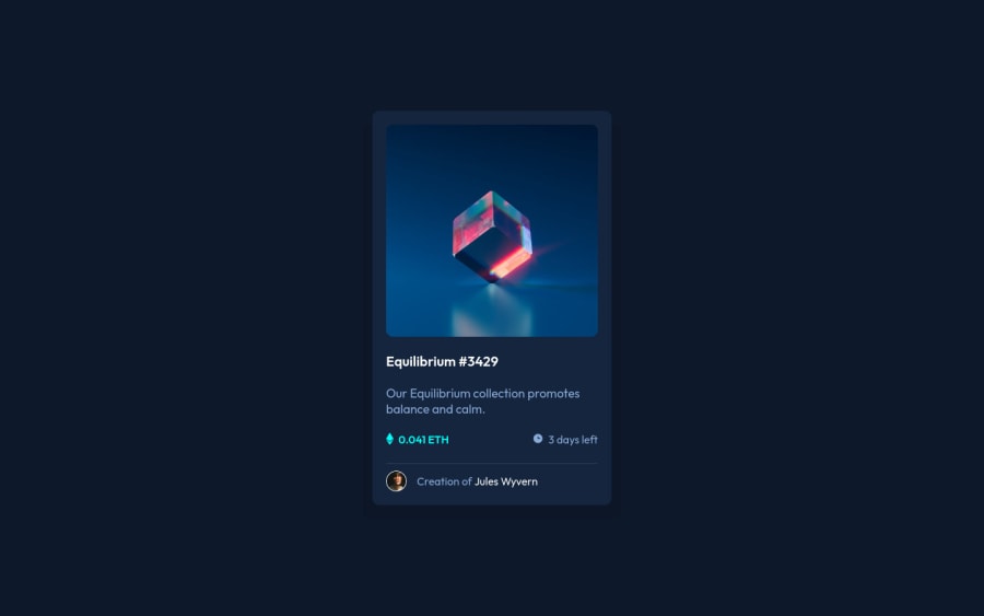
Hi, all! I thought this one would be easy, but it took a while to find a good and proper way to put the hover effect on the image. Anyway, it was a good challenge! All feedback and improvements are welcome =)
Community feedback
- @James-aldersonPosted about 2 years ago
Hi Cristina Kelly, I saw your design, it was very well designed, but there are a few small issues that you can fix to help make your design better.
as follows:
- Create a folder called 'assets' and put all the files related to the challenge inside it.
- Define your web fonts inside css, by doing this you have helped the HTML code to be seen better, and in addition, the challenge you have designed will load faster because the fonts will be loaded after the design is fully loaded، and until then it uses the system font for display.
- It is better to use the 'a' tag for texts that can be hovered.
- Use the 'table of content' above your css code, this will help your css codes to be better seen and clean.
- Challenge design for mobile resolution.
- Adding design screenshots to challenge files.
- Do not ignore the 'README' file, because it displays information about your design.
- ...
By the way, I have created a fork in your repository, you can add all the changes to your project this way.
These are some of the tips that help to improve your design, you can see all the changes in the commits section.
Don't forget to practice, because the more you practice, the better and faster you will design.
Happy coding :)
Marked as helpful0@cristinakellytPosted about 2 years agoHi James! Thank you for your time reviewing my code and for all your suggestions! I really appreciate them, and for sure will keep them in mind. As you said, these are small issues but it does a lot of difference. I am going to see it right now on Github!
0 - @correlucasPosted about 2 years ago
👾Hello Cristina K., congratulations for your new solution!
Your solution is just great, you've a really good work wrapping everything and using semantic tags, nice also the you've used
rem
values.Here's my tips for you:
Here's how to fix the responsivity for the card:
.card { max-width: 35rem; }
This is the correct value for the
box-shadow
.card { box-shadow: 5px 5px 15px 5px rgb(0 0 0 / 3%); /* box-shadow: -1.5rem 2rem 0 hsl(217deg 52% 10%), 1.5rem 2rem 0 hsl(217deg 52% 10%); */ }
Here's my solution for this challenge if you wants to see how I build it: https://www.frontendmentor.io/solutions/nft-preview-card-vanilla-css-custom-design-and-hover-effects-b8D1k9PDmX
👋 I hope this helps you and happy coding!
Marked as helpful0@cristinakellytPosted about 2 years ago@correlucas Hi Lucas!
Thank you for the tips! I just checked your solution and it is really good!
0 - @dtp27Posted about 2 years ago
Hi Christina!
That looks fantastic! I noticed that you're using the BEM naming convention. It was recommended to me that I start using it as well. How have you liked using it and how does it compare with anything you've used in the past?
Thanks!
Dan
1@cristinakellytPosted about 2 years agoHi Dan!
Thank you so much! Yes, I am trying to use BEM in my projects! I am enjoying using it because it is easier to think about class names. I use it almost since the beginning so I don't have anything to compare with. Also, I generally use SASS in my projects, and the BEM it is really helpful to nest classes. I did not use SASS here because it is a small challenge.
Hope you enjoy using it too!
1
Please log in to post a comment
Log in with GitHubJoin our Discord community
Join thousands of Frontend Mentor community members taking the challenges, sharing resources, helping each other, and chatting about all things front-end!
Join our Discord