Submitted almost 3 years ago
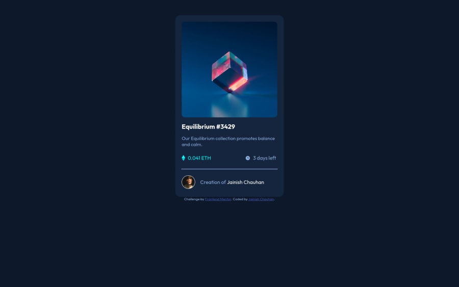
NFT Preview Card UI Desing using Pure HTML and CSS
@jainish011
Design comparison
SolutionDesign
Community feedback
- @fraserwatPosted almost 3 years ago
This is looking great - I love the hover animation!!
Couple of things I'd change:
- If you have a
min-height: 100vh(100% screen height) on the <body>, then you can usemargin: autoon the.containerto push your attribution element down to the bottom of the screen instead of being squashed up by your NFT card. You'll probably want to use a bit of padding-bottom on attribution to stop it being right at the bottom. - Think about what semantic HTML elements you can use to structure the page better. E.g.
.attributionas a <footer>. - Change
widthtomax-widthand then use padding to fill out the gap between the edge of the component and the image. Especially when you've got lots of components on the screen, you don't want to be too explicit with widths and heights to make your page more responsive.
Looks fantastic though, keep it up!
Fraser
Marked as helpful1 - If you have a
- @denieldenPosted almost 3 years ago
Hi Hackingdude, great job!
-Try use Flexbox for center the card, read here -> flex guide
Hope this help and happy coding :)
Marked as helpful1
Please log in to post a comment
Log in with GitHubJoin our Discord community
Join thousands of Frontend Mentor community members taking the challenges, sharing resources, helping each other, and chatting about all things front-end!
Join our Discord
