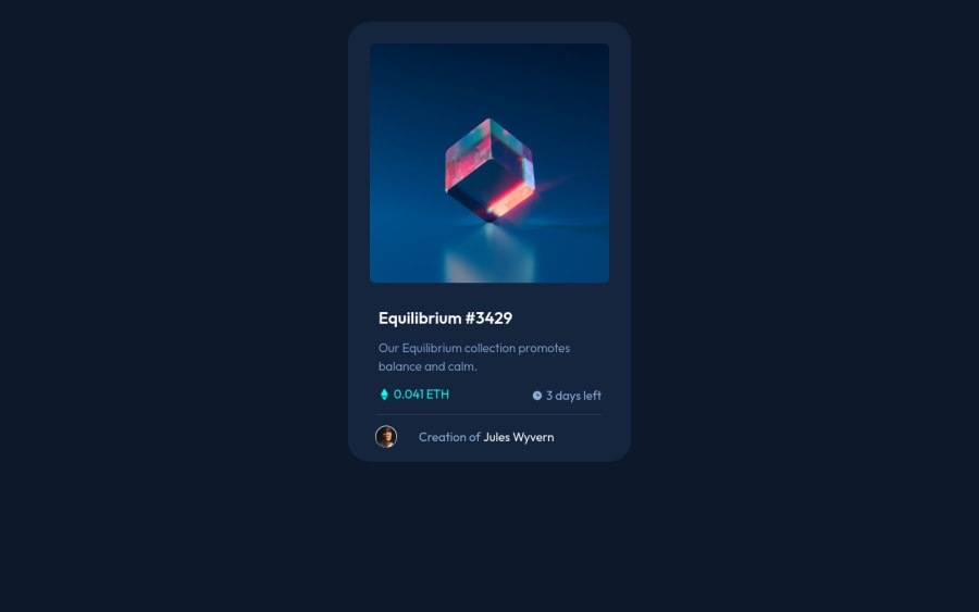
Design comparison
SolutionDesign
Solution retrospective
Any feedback is appreciated.
Community feedback
- @denieldenPosted almost 3 years ago
Hi Ozan, I took some time to look at your solution and you did a great job!
Also I have some tips for improving your code:
- add
maintag and wrap the card for Accessibility - centering a
divwithabsolutepositioning is now deprecated, it uses modern css likeflexbox or grid - try to use flexbox to the body for center the card. Read here -> best flex guide
- after add
min-heigth: 100vhto body because Flexbox aligns to the size of the parent container
Overall you did well :)
Hope this help and happy coding!
Marked as helpful1@denieldenPosted almost 3 years ago@zorluozan You are welcome! I would really appreciate if you mark my comment as helpful if it helped you, thank you very much :)
0 - add
Please log in to post a comment
Log in with GitHubJoin our Discord community
Join thousands of Frontend Mentor community members taking the challenges, sharing resources, helping each other, and chatting about all things front-end!
Join our Discord
