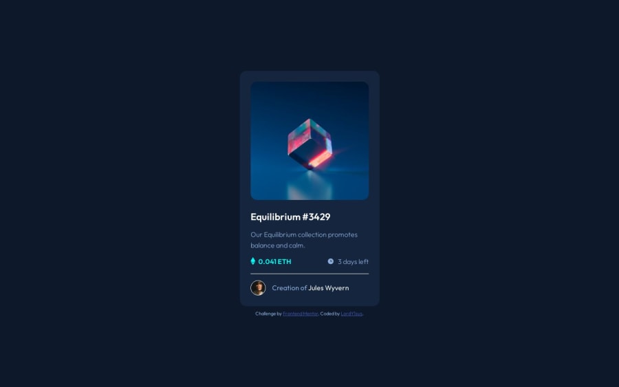
NFT Preview Card Solution Using CSS Flex-Box & Grid
Design comparison
Solution retrospective
Hello! I will really like to read your advices for this, I think I did a great job, but i think I can being better too. Beforehand, thanks a lot.
Community feedback
- @daniel-web-developerPosted almost 2 years ago
First of all, you did a good job in getting your design similar to the one proposed by Frontend Mentor.
I'm not a very experienced developer, so instead of saying you should do something, I'll say how I'd do it, because I'm not sure my way is the best way.
1 - I wouldn't comment on almost every element. It may be a good idea because it seems to make it easier for others to understand the code, but unless you have an absolute beginner coder, I don't think there's need for that much detail. This video from CodeAesthetic "advocates" for codes without any comments at all. It's rather interesting and I recommend it.
2 - I'd add hover animations. I know animations may sound really advanced and scary but these are rather easy. For instance, you could write on your CSS file:
a{
    ...
    transition: color 300ms ease-in-out;

    &:hover{
        color: var(--cyan);
    }
}
This would gradually change (in 300ms) the color of the author's name, making it look cooler in my opinion. I recommend using a class instead of doing like I did in the example, since you may have multiple <a> elements and you probably won't want every single one of them to have the same behaviour.
Marked as helpful1@LordY1susPosted almost 2 years agoHi Daniel, thanks for you comment. I want to tell you what it was very helpful: the video is very interesting, I really appreciate that. I gonna put it on in practice right now. Thanks a lot.
0
Please log in to post a comment
Log in with GitHubJoin our Discord community
Join thousands of Frontend Mentor community members taking the challenges, sharing resources, helping each other, and chatting about all things front-end!
Join our Discord
