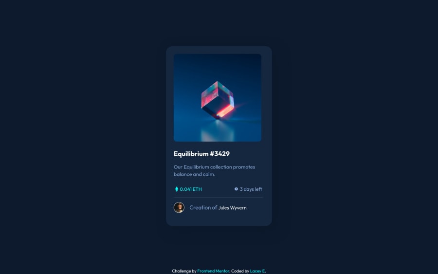
Design comparison
Solution retrospective
I found using hover difficult because of the eye icon. I couldn't seem to get it completely opaque like in the design files. I feel like I also maybe could've been more efficient with my code too.
My main question is how could I make the eye icon more opaque when I hover over the main image?
Community feedback
- @KaydenGiang2512Posted over 2 years ago
It was probably because I didn't phrase my suggestion well enough (quite hard to do so through text-only comments!), so I will paste in the link to my solution here so you can see what I tried to explain above. Hope this clears up any confusion you may have on our issue!
https://github.com/KaydenGiang2512/Article_Preview_Component
Best of luck :D
Marked as helpful1@laceederPosted over 2 years ago@KaydenGiang2512 You sent the wrong link, but I found the NFT one! I'll have to restructure some of the HTML, which I'll do when I have more free time. I now understand what you were trying to say and I think it'll be helpful! Thank you!
0@KaydenGiang2512Posted over 2 years ago@laceeder oops I did send the wrong link :D. Glad I was still able to help though and happy coding!
1 - @KaydenGiang2512Posted over 2 years ago
Hi Lacey, great work on this project overall. I actually completed this project a few weeks ago so I might have a solution to your "eye image opacity" issue, which is by separating the eye-icon from the NFT image into 2 separate <div> tags. After that, create another <div> as the overlay and use position: absolute for all of these to ensure that they stack on top of one another. By putting the eye-icon in its own <div> tag, the opacity attribute from the NFT image will no longer affect it, and you can independently set the opacity of the eye to your choosing. Hope this helps and happy coding!
P.S. the image is not horizontally centered in the entire card element, so that's another thing you should look into.
0@laceederPosted over 2 years ago@KaydenGiang2512 Hi! Thank you for the suggestions! However, when I separated the eye icon and set the position to absolute, it wasn't set as the overlay and just was in the top left corner of the image. And the main image was zoomed in. Not sure if I understood what you suggested or not, so I don't want to say it didn't work. Just not in the way I tried.
0 - @Bayoumi-devPosted over 2 years ago
Hey Lacey, It looks great!...
To fix the view-icon transparent, Use
background-color: hsla(178, 100%, 50%, 0.5);instead ofbackground-color: #00fff7;and changeopacity: 0.7;toopacity: 1;.overlay { background-color: hsla(178, 100%, 50%, 0.5); //... } .img-wrapper:hover .overlay { opacity: 1; }Hope this is helpful to you... Keep coding👍
0@laceederPosted over 2 years ago@Bayoumi-dev Oh no, the transparency amount wasn't the issue. The eye icon wasn't solid white and was the same transparency as my overlay. I was wanting to fix that. But could you explain why I should use the hsla value instead of hex, please? Thank you!
0@Bayoumi-devPosted over 2 years ago@laceeder It’s pretty much a matter of preference...In my opinion, HSLA and RGBA are readable and easier to use for animation. In this case, you can use HEX
Change
background-color: #00fff7;tobackground-color: #00fff780;1
Please log in to post a comment
Log in with GitHubJoin our Discord community
Join thousands of Frontend Mentor community members taking the challenges, sharing resources, helping each other, and chatting about all things front-end!
Join our Discord
