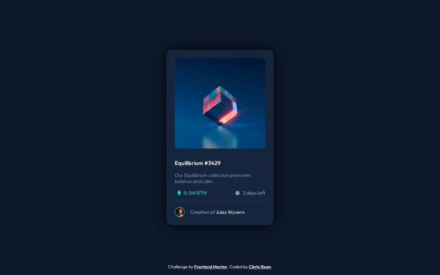


Design comparison

Solution retrospective
My process
Built with
- Semantic HTML5 markup
- CSS custom properties
- Flexbox
- Mobile-first workflow
What I learned
This was used mostly as practice for two things: semantic HTML and CSS positioning. I was able to create the layout I wanted without using pseudo-elements which I had been doing in the past.
Continued development
One thing I did not attempt with this challenge was to use Javascript to impact active states. Since I wanted to focus mostly on honing my CSS skills, this inherently left me at a disadvantage when it comes to getting more Javascript practice. One thing that I struggled with for the CSS portion of the project was creating the overlay on the main card image. I was not able to get it color-perfect because I used opacity properties on the element behind it (which became above it on hover), thus was unable to set the opacity in the child image (eyeball) even using the !important declaration.
Useful resources
For this I used the CSS documentation on MDN.
Community feedback
Please log in to post a comment
Log in with GitHubJoin our Discord community
Join thousands of Frontend Mentor community members taking the challenges, sharing resources, helping each other, and chatting about all things front-end!
Join our Discord