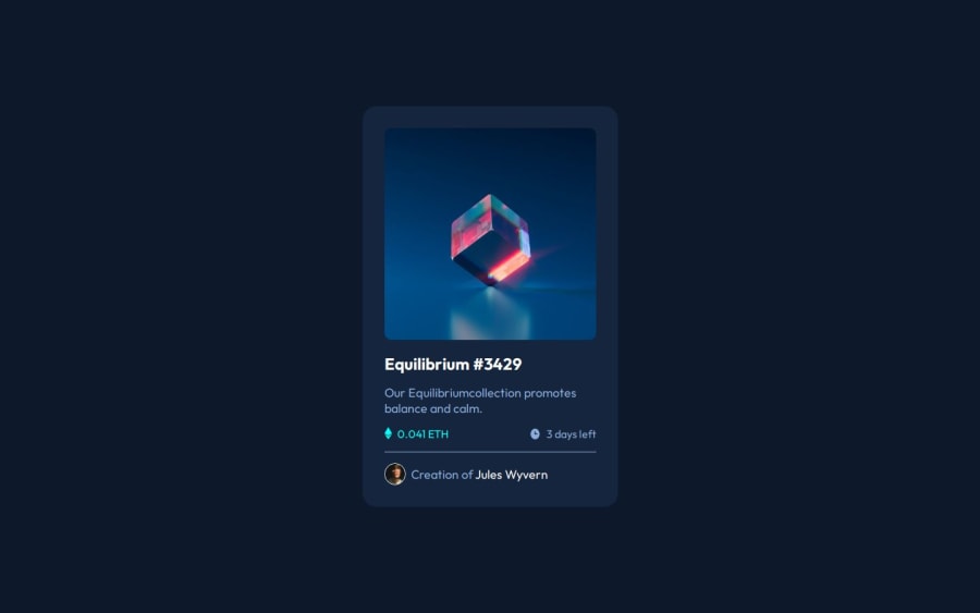
Design comparison
SolutionDesign
Solution retrospective
What are you most proud of, and what would you do differently next time?
Happy with the overall outcome, I believe it turned out quite nice. Also quite pleased that it didn't take too long to complete.
What challenges did you encounter, and how did you overcome them?The project was pretty straight forward, I just had difficulty with a couple of parts and I came up with pretty 'hacky' solutions.
First being the hover-state / overlay for the main image. Couldn't find a tidy way of doing this and just had to resort to what I did in the code.
Second was sorting out the span used for the Author title. Felt like a really hacky way of getting it done.
What specific areas of your project would you like help with?Overall feedback, ways to improve would be appreciated.
Community feedback
Please log in to post a comment
Log in with GitHubJoin our Discord community
Join thousands of Frontend Mentor community members taking the challenges, sharing resources, helping each other, and chatting about all things front-end!
Join our Discord
