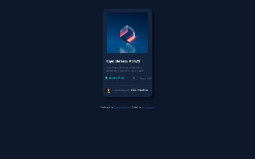
Submitted over 3 years agoA solution to the NFT preview card component challenge
NFT preview card
accessibility, angular, express, jquery, backbone
@Ericwiz

Solution retrospective
Amazing Project, it was fun throughout the coding period, from start to finish. however, I found it difficult adding the horizontal line that separated the image section from the rest of the card...I would need help in adding and adjusting the line properly.
please criticize my work and suggest areas of improvement!
Code
Loading...
Please log in to post a comment
Log in with GitHubCommunity feedback
No feedback yet. Be the first to give feedback on Eric Wisdom Agu's solution.
Join our Discord community
Join thousands of Frontend Mentor community members taking the challenges, sharing resources, helping each other, and chatting about all things front-end!
Join our Discord