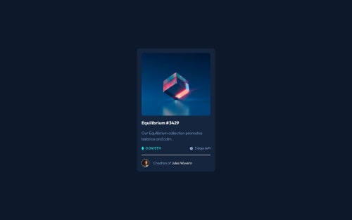
Submitted over 1 year agoA solution to the NFT preview card component challenge
nft-preview-card
P
@Hexerse

Solution retrospective
What are you most proud of, and what would you do differently next time?
Nothing
What challenges did you encounter, and how did you overcome them?The image is abit wonky as its height and width don't really match. If anyone has a good solution to knowing how to fit weird image proportions please show me.
What specific areas of your project would you like help with?If anyone has a good solution to knowing how to fit weird image proportions please show me.
Code
Loading...
Please log in to post a comment
Log in with GitHubCommunity feedback
No feedback yet. Be the first to give feedback on Hexerse's solution.
Join our Discord community
Join thousands of Frontend Mentor community members taking the challenges, sharing resources, helping each other, and chatting about all things front-end!
Join our Discord