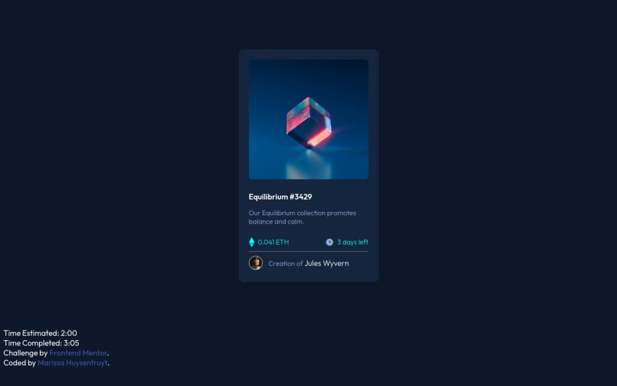
NFT Preview Card (html, css, flex)
Design comparison
Solution retrospective
Any feedback on how to improve the build is always welcome!
Community feedback
- @denieldenPosted almost 3 years ago
Hi Marissa, great job!
Remove all
marginfromcard_containerclass... they are superfluous using flexbox. Read here -> flex guideFor center card add this to body:
align-items: center;
justify-content: center;
height: 100vh;
Also set
heigthof body to100vhbecause Flexbox aligns to the size of the parent container.Hope this help and happy coding :)
0@marissahuysentruytPosted almost 3 years ago@denielden Ah I forget about vh a lot of times. Thanks!
1Account deletedtry to check kevin powell and check of his playlist I learn a lot from him or coder coder and check her playlist too she doing a challenge from frontend.io specifically intermidiate and junior section
0 - Account deleted
Nice Job! Keep doing your work I'm newbie too but I'm more excited creating landpage!
0
Please log in to post a comment
Log in with GitHubJoin our Discord community
Join thousands of Frontend Mentor community members taking the challenges, sharing resources, helping each other, and chatting about all things front-end!
Join our Discord
