Design comparison
SolutionDesign
Solution retrospective
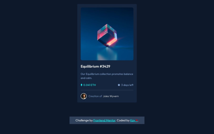
Hi, community 🌟 This is my attempt at the NFT preview card.
Many things need improving, but notably on my list to attend to are:
- Accessibility: It's not accessible at all.
- Hover has an overflow of color in the overlay. Not sure how to fix that; likely solution is to change it to the recommended method GraceSnow on Discord has up. I was a tad confused, so I will return to understand more in a bit.
- Not sure if the size of the card is an issue. I don't know, but I will tinker more.
Feedback appreciated as always
Community feedback
- @shoxjahon527Posted about 1 year ago
This comment was deleted 12 months ago
0@ofthewildfirePosted about 1 year ago@shoxjahon527 Where? Around the card. I do. Around the image? I do there too. I don't see anywhere else a border radius was needed?
0@ofthewildfirePosted about 1 year ago@shoxjahon527 There is a 15px border-radius on my card. Can you be more specific.
0
Please log in to post a comment
Log in with GitHubJoin our Discord community
Join thousands of Frontend Mentor community members taking the challenges, sharing resources, helping each other, and chatting about all things front-end!
Join our Discord
