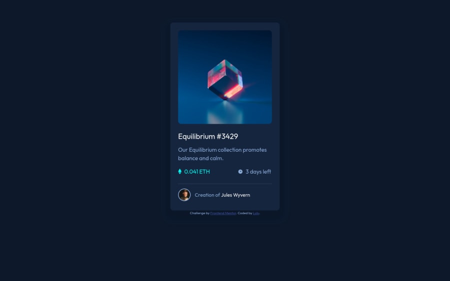
Design comparison
Solution retrospective
I have been struggling to adjust the hover icon cos its an svg file... any idea on how I can go about it???
Community feedback
- @PhoenixDev22Posted over 2 years ago
Hello Oluchi Onyeguke
Congratulation on completing this challenge. Excellent work! I have few suggestions regarding your solution, if you don't mind:
HTML
- Page should contain a level-one heading. For future use , use the headers in a chronological order. How you order headings dictates how a screen reader will navigate through them. As you go down a level, the number should increase by one, like a numbered list within an outline. In this challenge , as it’s not a whole page, you can have
<h1>visually hidden withsr-onlyclass and use<h2>instead of<h4>
- You can use
<main>landmark to wrap the NFT card and<footer>for the attribution.HTML5 landmark elements are used to improve navigation experience on your site for users of assistive technology.,
-
Since there's a :hover state on the image and means it's interactive, So there should be an interactive element around it. When you create a component that could be interacted with a user , always remember to include interactive elements like(button, textarea,input, ..) for this imagine what would happen when you click on the image, there are two possible ways:
1: If clicking the image would show a popup where the user can see the full NFT, here you use<button>. 2:If clicking the image would navigate the user to another page to see the NFT, here you can use<a>. For the same reason , you can use<a>to wrapEquilibrium #3429andJules Wyvern. -
The link wrapping the equilibrium image should either have
Sr-onlytext, anaria-labeloralttext that says where that link takes you. -
For any decorative images, each img tag should have empty
alt=""and addaria-hidden="true"attribute to make all web assistive technologies such as screen reader ignore those images in(icon-view, icon-ethereum, icon-clock). -
If you wish to draw a horizontal line, you should do so using appropriate CSS. You may remove the
<hr>, you can useborder-top:to the avatar's part. -
To use more semantic tags , you may use
<figure>and<figcaption>for the avatar's part. -
The avatar's alt should not be avatarit’s meaningless. You can use the creator's name
Jules Wyvern. Read more how to write an alt text -
For middle part of the card, you can use an unordered list
<ul>, in each<li>there should be<img>and<p>that way you can align them centrally.
- Adding
rel="noopener"orrel="noreferrer"totarget="_blank"links. When you link to a page on another site using target=”_blank” attribute , you can expose your site to performance and security issues.
There are so many ways to do the hover effect on the image, The one I would use is pseudo elements
::before, ::after. You can use pseudo-elements to change the teal background color to hsla. Then the opacity can be changed from 0 to 1 on the pseudo element on the hover. Also using pseudo elements makes your HTML more cleaner as there's no need for an extra clutter in the HTML . You can have a look at my solution here, it might help.Also, I really recommend to check @vanzasetia’s solution as he always provide very detailed READMe.md files explaining the process of building the project, and I'm sure It will be helpful.
Overall , your solution is great. Hopefully this feedback helps.
Marked as helpful1@lulublakePosted over 2 years ago@PhoenixDev22 thanks a lot 🤗, I will definitely check them out
1 - Page should contain a level-one heading. For future use , use the headers in a chronological order. How you order headings dictates how a screen reader will navigate through them. As you go down a level, the number should increase by one, like a numbered list within an outline. In this challenge , as it’s not a whole page, you can have
- @remtainePosted over 2 years ago
Looks good! Aside from the mentioned problem with the eye centering, everything seems to be in order. I suggest you look into flexbox, it'll really help with regards to centering. The eye image being an svg shouldn't matter, any image type can be centered like that.
Apart from that, it looks great! Good job!
Marked as helpful0
Please log in to post a comment
Log in with GitHubJoin our Discord community
Join thousands of Frontend Mentor community members taking the challenges, sharing resources, helping each other, and chatting about all things front-end!
Join our Discord
