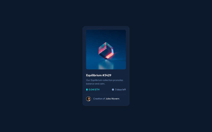
Design comparison
Solution retrospective
Hi! My solution works, but I'm still trying to get my head around the principles of creating layouts, so, I'd specifically like feedback on best practices regarding that, if possible.
(Sorry in advance, because I haven't used Semantic HTML. That's my next goal :)
Thanks in advance!
Community feedback
- @PhoenixDev22Posted almost 3 years ago
Hello @10high ,
I have some suggestions regarding your solution:
-
Use <main> to wrap the body content
class="wrapper". HTML5 landmark elements are used to improve navigation . -
For any decorative images, each img tag should have empty
alt=""andaria-hidden="true"attributes to make all web assistive technologies such as screen reader ignore those images in(icon-view, icon-ethereum, icon-clock). -
the
icon-viewdoesn't really need to be in the html, you could do it with css. If you want it to stay in html it needs to be aria-hidden or role presentation with empty alt. -
The avatar 's alt should not be
Creator Profile Picture, it's meaningless. you can setJules Wyvernto it. -
the link should be wrapping the main image and either have
Sr-onlytext, anaria-labeloralttext that says where that link takes you. -
It' better not to use
<span>anddivfor meaningful content . -
You can use an unordered list
<ul>to wrapclass="detailswrapper"and in each<li>, there would be<img >and<p>. -
Use
min-height: 100vhfor the<body>
min-height: 100vh;/*using vh (viewport height) units to allow the body to set a minimum height value based upon the full height of the viewport. This also allows the body to to grow taller if the content outgrows the visible page.*/-
In
line-height: 2.1em;, use unitless value for theline-height, this is the preferred way to set line-height and avoid unexpected results due to inheritance.Read more in MDN. -
You should use
emandremunits .Bothemandremare flexible, Usingpxwon't allow the user to control the font size based on their needs.
Overall, your solution is good, Hopefully this feedback helps.
Marked as helpful1@10highPosted over 2 years agoHi @PhoenixDev22
Thanks a lot for the pointers. There's lots of useful stuff there that I've used for the next challenge I'm doing.
1 -
- @GitHub-dev12345Posted almost 3 years ago
If you want to reduce accessibility to change this code 😊
<div class="wrapper"> to <main> ( Used main tag );I hope again you find this helpful
0 - @GitHub-dev12345Posted almost 3 years ago
Congratulation to complete the challenge ❤️👍 My small suggestion : 1.In Card design CSS Code Used this:
transform : scale(0.8); this property decrease the size of card. 😉
large size for increase the number of scale & small size for decrease the number of scale
I hope you find this helpful
0
Please log in to post a comment
Log in with GitHubJoin our Discord community
Join thousands of Frontend Mentor community members taking the challenges, sharing resources, helping each other, and chatting about all things front-end!
Join our Discord
