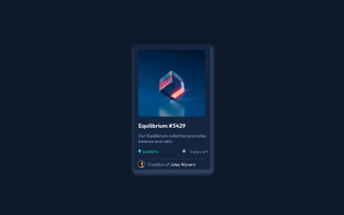
Design comparison
Solution retrospective
• I couldn't understand how i could center an image inside another image, also creating a hover state for the images was impossible for me
• The ETH balance and timer doesn't seem to align well, how do i achieve this. Thank you !
Community feedback
- @faha1999Posted about 2 years ago
Hello, saminstein Congratulations on finishing this project. It's lovely and great on the whole! Just a little tip:
- You might want to use semantic tags like the
<main>
to wrap your code, instead ofarticle
. like
<main class="nft-container"> </main>
This would help improve accessibility.
-
add favicon
<link rel="icon" type="image/png" sizes="32x32" href="./images/favicon-32x32.png">
-
add
<html lang="en">
-
.nft-container
background shadow isbox-shadow: #0c1627 0px 14px 28px, #0c1627 0px 10px 10px;
-
Instead of using
px
, use relative units likerem or em
to get better performance when the information on your page needs to be resized for multiple screens and devices.REM
andEM
apply to all sizes, not justfont-size
. You can code your entire page inpx
and then, at the very end, use the VsCode pluginpx to rem
to perform the automatic conversion px to rem
I hope it will work. Happy coding.
Marked as helpful1 - You might want to use semantic tags like the
- @correlucasPosted about 2 years ago
👾Hello @saminstein, Congratulations on completing this challenge!
Nice code and nice solution! You did a good job here putting everything together. I’ve some suggestions for you:
Here's how you can add the hover effect:
Container needed to position the overlay. Adjust the width as needed
.container { position: relative; width: 100%; max-width: 340px; }
Make the image to responsive
.image { width: 100%; height: auto; }
The overlay effect (full height and width) - lays on top of the container and over the image
.overlay { position: absolute; top: 0; bottom: 0; left: 0; right: 0; height: 100%; width: 100%; opacity: 0; transition: .3s ease; background-color: red; }
When you mouse over the container, fade in the overlay icon
.container:hover .overlay { opacity: 1; }
The icon inside the overlay is positioned in the middle vertically and horizontally .icon { color: white; font-size: 100px; position: absolute; top: 50%; left: 50%; transform: translate(-50%, -50%); -ms-transform: translate(-50%, -50%); text-align: center; }
When you move the mouse over the icon, change color
.icon-eye:hover { color: hsl(178, 100%, 50%, 0.5);; }
👨💻Here's my solution for this challenge if you wants to see how I build it: https://www.frontendmentor.io/solutions/nft-preview-card-vanilla-css-custom-design-and-hover-effects-b8D1k9PDmX
✌️ I hope this helps you and happy coding!
Marked as helpful1
Please log in to post a comment
Log in with GitHubJoin our Discord community
Join thousands of Frontend Mentor community members taking the challenges, sharing resources, helping each other, and chatting about all things front-end!
Join our Discord