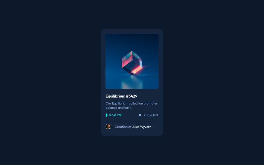
Design comparison
Solution retrospective
ENG - Challenge proposed by Frontend Mentor, to train and test the skills acquired during the study, always focusing on real projects for the job market. All criticisms are welcome!
PTBR - Desafio proposto pelo Frontend Mentor, para treinar e testar as habilidades adquiridas durante o estudo, sempre focando em projetos reais para o mercado de trabalho. Todas as criticas e são bem vindas!
Community feedback
- @pikapikamartPosted almost 3 years ago
Hey, awesome work on this one. The overall layout I think looks great.
David Turner already gave a feedback on this one, just going to add some suggestions as well:
- Don't use
position: absolute
a very large element. If you inspect your layout, hover on eitherhtml
orbody
tag, you will notice that it has no height since its element is beingabsolute
. Since you are just using this to center the layout, it would be much better to do it this way. But first, remove these stylings on the.container
selector:
position top left transform
I also saw that the
.card
is using this stylings, you can remove that as well. Typically, we only want toabsolute
something when we are properly controlling the element. For this one, you don't really need that since a flexbox parent could do it properly. You could add these on thebody
tag:align-items: center; display: flex; justify-content: center; min-height: 100vh;
- The
.container
should be usingmain
like what David had said, becausemain
tag is landmark element that helps/guides user to navigate content properly using screen-reader and just semantic markup in general. - For this one, since the nft image is being treated as interactive component, there should be an interactive element that nest or sits inside the container. For this, you are not using an
img
for the nft image ( could use img ),div
in general is not good for being interactive since it won't be toggled by other peripherals. Use eithera
tag orbutton
on this, it could nest the nft image. - The preview-icon on this one is only acting as decorative images. Decorative images are just images that doesn't contribute to the overall content of the site. They should be hidden for screen-reader at all times by using
alt=""
andaria-hidden="true"
to theimg
tag or onlyaria-hidden="true"
if you are usingsvg
instead ofimg
tag. - On this, the nft name could be using an
h1
. But if you don't want to useh1
on it, change it toh2
so that you won't be skipping a heading tag level. You may remember, anh1
is needed on the page. Since there are no visible text that are suitable to beh1
, theh1
would be a screen-reader only heading. Meaning it will be hidden visually but present for screen-reader users. On this, theh1
would have likesr-only
class and the text-content should describe what is the main-content is all about. Theh1
could be placed as the first text inside themain
.Have a look at this example snippet that I have about screen-reader only h1. Comments are already included in here. - The nft name is treated interactive as well. Wrap the inner text of the heading tag by
a
tag. - The eth-icon and the clock-icon could be just hidden since on a real site, there would be bunch of nft card with the same content and there would be plenty of these icons in there as well. You don't want the user to traverse all these repetitive images. Use the method above.
- When wrapping up a text-content, make sure that it is inside a meaningful element like
p
tag or heading tag and not using likediv, span
to wrap the text. - Person's
img
could use the person's name since it is already included. - Use
a
tag instead ofspan
to wrap the person's name sincespan
is not intended to be interactive.
Aside from those, great job again on this one.
Marked as helpful0@TrigoZinPosted almost 3 years ago@pikapikamart Oh, thanks for the help!
I work on it to be better, thanks a lot! ♥
1 - Don't use
- @brodiewebdtPosted almost 3 years ago
Looks very good. The alignment and spacing look great. Hover effects all work right.
Wrap your container div in a Main tag and change the Equilibrium text to an H1 and it will clear the accessibility warnings. You will have to re-style the H1 to look like it does now.
Download AXE DevTools and you can clear accessibility warnings while you code. https://www.deque.com/axe/devtools/
Hope this helps.
Marked as helpful0
Please log in to post a comment
Log in with GitHubJoin our Discord community
Join thousands of Frontend Mentor community members taking the challenges, sharing resources, helping each other, and chatting about all things front-end!
Join our Discord