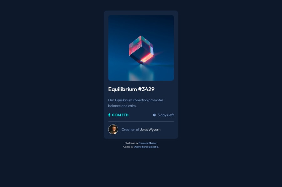
Design comparison
Community feedback
- @HassiaiPosted almost 2 years ago
To center the main on the page, add min-height:100vh; display: flex; align-items: center: justify-content: center; or min-height:100vh; display: grid place-items: center to the body.
Give the max-width of the main a fixed value instead of a percentage value. e.g:
max-width=400px;Hope am helpful.
Well done for completing this challenge. HAPPY CODING
Marked as helpful1 - @VCaramesPosted almost 2 years ago
Hey there! 👋 Here are some suggestions to help improve your code:
- The NFT image
alt tagdescription needs to be improved upon. This is what your users are purchasing. Assume you’re describing the image to someone over the phone.
- The “Icons” serve no other purpose than to be decorative; They add no value. Their
alt tagshould left blank and have anaria-hidden=“true”to hides it from assistive technology.
More Info:📚
https://www.w3.org/WAI/tutorials/images/
- Wrap the "NFT image", "Equilibrium #3429" and "Jules Wyvern" in an
anchor tags. The anchor tag will allow users to click on content and have them directed to another part of your site.
More Info:📚
- The profile image
alt tagneeds to be improved. It should only state the following; “Headshot of -person’s full name-“
More Info:📚
- Your
CSS Resetis being underutilized. To fully maximize it, you will want to add more to it.
Here are some examples that you can freely use:
If you have any questions or need further clarification, feel free to reach out to me.
Happy Coding! 🎄🎁
0 - The NFT image
Please log in to post a comment
Log in with GitHubJoin our Discord community
Join thousands of Frontend Mentor community members taking the challenges, sharing resources, helping each other, and chatting about all things front-end!
Join our Discord
