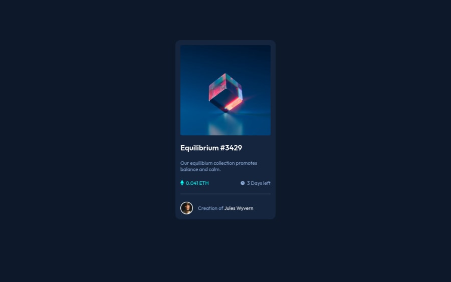
Design comparison
SolutionDesign
Solution retrospective
Hi everyone, this is my solution of this challenge, im open for your feedback this is very important for me.
Thanks.
Community feedback
- @GiDDeRoPosted about 2 years ago
Nice Solution.
- You forgot the active-states.
- To center the card. body { display: flex; height: 100vh; align-items: center; justify-content: center}
- Div(s) are great as containers. For easy navigation, accessibility and clarity, learn to use semantic tags instead
Marked as helpful0
Please log in to post a comment
Log in with GitHubJoin our Discord community
Join thousands of Frontend Mentor community members taking the challenges, sharing resources, helping each other, and chatting about all things front-end!
Join our Discord
