


@correlucas
Posted
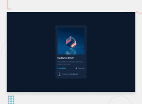
👾Hi Moderse, congratulations on your solution!👋 Welcome to the Frontend Mentor Coding Community!
Great solution and a great start! From what I saw you’re on the right track. I’ve few suggestions for you that you can consider adding to your code:
1.Add transitions to make the interaction smoother while the element gets hovered, you can use a value like transition: all ease-in 0.5s.
2.It's even better to use relative units as rem or em that have a better fit if you want your site more accessible between different screen sizes and devices. REM and EM does not just apply to font size, but to all sizes as well.
3.The box-shadow is a bit too strong, this is due the opacity and blur. The secret to create a perfect and smooth shadow is to have low values for opacity and increase blur try this value instead: box-shadow: 12px 7px 20px 6px rgb(57 75 84 / 8%);
👨💻Here's my solution for this challenge if you wants to see how I build it: https://www.frontendmentor.io/solutions/nft-preview-card-vanilla-css-custom-design-and-hover-effects-b8D1k9PDmX
✌️ I hope this helps you and happy coding!
Marked as helpful

