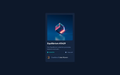
Submitted almost 3 years agoA solution to the NFT preview card component challenge
Nft preview card using flexbox and scss
sass/scss
@abelgmz

Solution retrospective
The project was good to practice my flexbox skills. The overlay effect over the image was the obstacle. I made a research and I found a solution, but I would like to know if there is a better way to do this effect.
Any feedback is welcome, thanks :)
Code
Loading...
Please log in to post a comment
Log in with GitHubCommunity feedback
No feedback yet. Be the first to give feedback on Abelardo Gomez Rodriguez's solution.
Join our Discord community
Join thousands of Frontend Mentor community members taking the challenges, sharing resources, helping each other, and chatting about all things front-end!
Join our Discord