Submitted almost 2 years ago
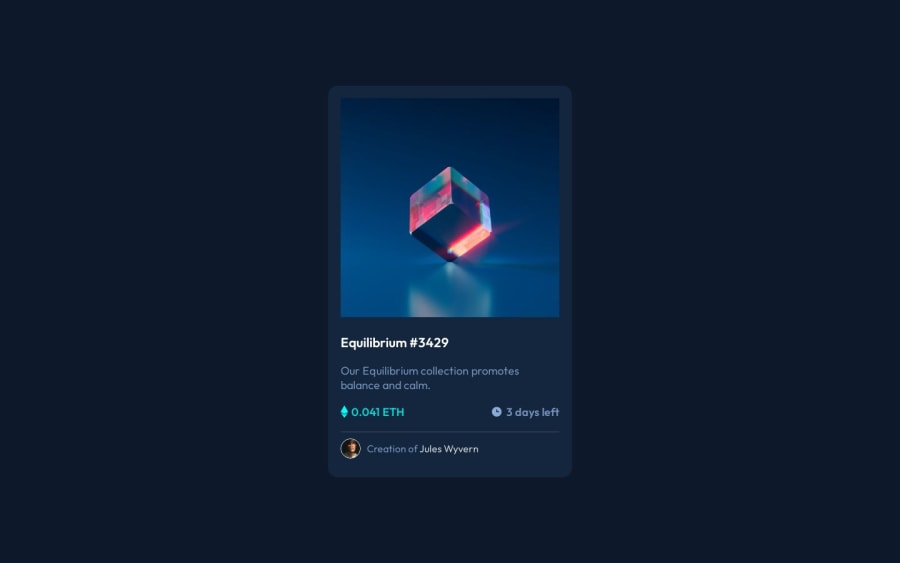
NFT Preview Card Component with HTML, CSS and Sass
#sass/scss
@drangam9
Design comparison
SolutionDesign
Community feedback
- @fernandolapazPosted almost 2 years ago
Hi 👋🏻, some of this may interest you:
HTML / ACCESSIBILITY:
- The main content of every page (the card in this case) should be wrapped with the
<main>tag.
- Every page should have an
<h1>. It is good not to skip heading levels.
- The icons are decorative images and therefore need an empty
altattribute to be ignored by a screen reader.
- When there is a hover state over an element it means that it is interactive, so there must be an interactive element around it (like a link or a button). So, we should use a
<a>or<button>to wrap the image (depending on what happened when clicking on it). Also 'Equilibrium #3429' and 'Jules Wyvern' should be wrapped with the<a>tag.
CSS:
- You might consider using some CSS reset as a good practice at the start of each project, to have a clean starting point and reduce differences between browsers. For example, here are some very common and useful ones to get you started:
* { box-sizing: border-box; margin: 0; padding: 0; }- It is better to use
min-height: 100vh;for the body, as usingheight: 100%causes the page to be cut off in viewports with small height (such as mobile landscape orientation).
- Think about using relative units like rem or em since they are better for scalable layouts. Something simple to start with would be to convert to rem (1 rem equals 16px by default). Consider this suggestion especially for the
font-size.
I hope it’s useful : )
Regards,
Marked as helpful1 - The main content of every page (the card in this case) should be wrapped with the
Please log in to post a comment
Log in with GitHubJoin our Discord community
Join thousands of Frontend Mentor community members taking the challenges, sharing resources, helping each other, and chatting about all things front-end!
Join our Discord
