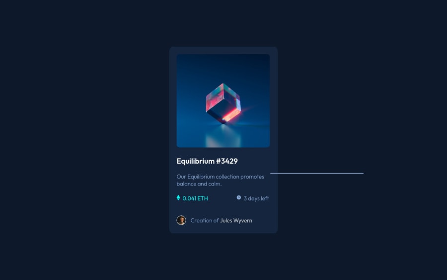
NFT Preview Card Component with HTML and CSS
Design comparison
Community feedback
- @RioCantrePosted about 3 years ago
Hello there! Good job in this challenge. Viewing the solution, I think you should consider the following as well…
- Instead of
div, alternatively wrap the whole content withmaintag . Use semantic tags, for HTML structures, refer it with this one Semantics - Remove unnecessary code to keep it clean
- Clean the whitespaces in the code
- Include description with the
altin image tags. Like this line<img src="./images/icon-ethereum.svg" alt=""> - Instead of using
hr, alternative it to wrap a section withdiv
From:
<img id="avatar" src="./images/image-avatar.png" alt="avatar">

    <p id="credits">Creation of <a id="jules" href="#">Jules Wyvern</a> </p>

Into:

<div class="sample name here">
    <img id="avatar" src="./images/image-avatar.png" alt="avatar">
    <p id="credits">Creation of <a id="jules" href="#">Jules Wyvern</a> </p>
<div>

Css :
.sample {
    border-top: 1px solid 'color value'
}
Above all, Well done! Keep it going!
Marked as helpful0@elleneartelegPosted about 3 years ago@RioCantre Hello there! Thank you so much for your helpful insight, it's actually my first try in this challenge and I've only been learning HTML and CSS for 19 days. I agree that there are still things to clean up, but still wanted to submit this one so that I can have a reference point of my journey. I will try to implement your suggestions, thank you again so much! :))
0 - Instead of
Please log in to post a comment
Log in with GitHubJoin our Discord community
Join thousands of Frontend Mentor community members taking the challenges, sharing resources, helping each other, and chatting about all things front-end!
Join our Discord
