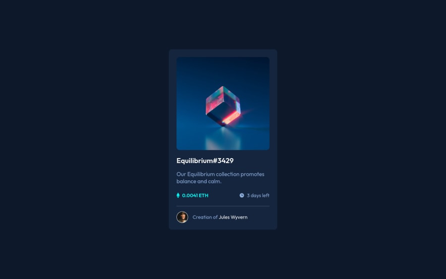
Design comparison
Solution retrospective
Do I need to fix something?
I think the code could be more simplified, especially the <div> part. How can I make it more "optimized and smaller"?
Feedback welcome!
Community feedback
- @PhoenixDev22Posted over 2 years ago
Hello Rafael Holanda,
Congratulation on completing this challenge. Excellent work! I have few suggestions regarding your solution, if you don't mind:
HTML
- The most important part in this challenge interactive elements. Since there's a :hover state on the image and means it's interactive, So there should be an interactive element around it. When you create a component that could be interacted with a user , always remember to include interactive elements like(button, textarea,input, ..)
for this imagine what would happen when you click on the image, there are two possible ways:
1: If clicking the image would show a popup where the user can see the full NFT, here you use<button>
. 2:If clicking the image would navigate the user to another page to see the NFT, here you can use<a>
.
For the same reason, use
<a>
to wrapEquilibrium #3429 and Jules Wyvern
.- The link wrapping the equilibrium image should either have
Sr-only
text, anaria-label
oralt
text that says where that link takes you.
- For any decorative images, each img tag should have empty
alt=""
and addaria-hidden="true"
attributes to make all web assistive technologies such as screen reader ignore those images in(icon-view, icon-ethereum, icon-clock ).
- Profile images like that avatar are valuable content. The alternate text of the avatar’s image should not be
Artist avatar
, it’s meaningless. You can use the creator's nameJules Wyvern
. Read more how to write an alt text
- If you wish to draw a horizontal line, you should do so using appropriate CSS. You may remove the
<hr>
, you can useborder-top:
to the avatar's part.
- For middle part of the card, you can use an unordered list
<ul>
, in each<li>
there should be<img>
and<p>
. That way you can align them centrally.
- There are so many ways to do the hover effect on the image, The one I would use is pseudo elements
::before, ::after
. You can use pseudo-elements to change the teal background color to hsla. Then the opacity can be changed from 0 to 1 on the pseudo element on the hover. Also using pseudo elements makes your HTML more cleaner as there's no need for extra clutter in the HTML.
Aside, your solution looks great. Hopefully this feedback helps.
Marked as helpful1@rafael-holandaPosted over 2 years ago@PhoenixDev22 Thanks a lot for the feedback! The links related to how to write alt texts are very helpful. About the interactive elements, I still have a lot to learn, but I'll try to make this card more interactive, following your suggestions.
Also, this is the first time I've heard about pseudo-elements, I really need to test and implement them in code!
1 - The most important part in this challenge interactive elements. Since there's a :hover state on the image and means it's interactive, So there should be an interactive element around it. When you create a component that could be interacted with a user , always remember to include interactive elements like(button, textarea,input, ..)
for this imagine what would happen when you click on the image, there are two possible ways:
- @correlucasPosted over 2 years ago
Fala Rafael, beleza? Parabéns pelo desafio!
Acabei de olhar seu repositório e seu código e tenho una dica a respeito ds estrutura do codigo, seu arquivo html ta com a identacao um pouco estranha, por exemplo, algumas tags estao em outras linhas, o espaçamento ta meio estranho, isso nao influencia no codigo em si, funciona, mas fica um pouco ruim se alguma outra pessoa for ler.
Se vv tiver usando o VScode tem uma extensão que formata seu código em automático e deixa ele no padrão da indústria identado e com a melhor formatação pra leitura, o nome é
prettier
.Em relação ao container e o card, abri ele pelo celular e parece um pouco grande o tamanho desse container/card é de exatamente
max-width: 340px
.Espero ter ajudado e continue no foco!
Marked as helpful1@rafael-holandaPosted over 2 years ago@correlucas Opa Lucas! Vou baixar a extensão depois no meu vscode.
Também vou ver em relação a largura do card. É a primeira vez que vejo sobre essa propriedade
max-width
.Muito obrigado pelo feedback!
0@correlucasPosted over 2 years ago@rafael-holanda cara max-width é basicamente vc dizendo pro container que ele vai ter no máximo 340px mas pode diminuir e 'min-width'*o oposto, width sozinho é fixo quer dizer que ele tera esse tamamho invariavelmente, então pra componentes responsivos use sempre max-width ou min-width
Marked as helpful1
Please log in to post a comment
Log in with GitHubJoin our Discord community
Join thousands of Frontend Mentor community members taking the challenges, sharing resources, helping each other, and chatting about all things front-end!
Join our Discord