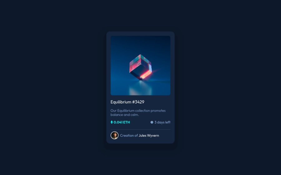
Design comparison
Solution retrospective
I would like to receive criticism so that I can improve my code.
Community feedback
- @anoshaahmedPosted about 3 years ago
To avoid accessibility issues in the future have at least one h1 in your code
Good job! :)
Marked as helpful1 - P@brodiewebdtPosted about 3 years ago
You did a good job on the card. Alignment, spacing and the hover effects all look good.
You want to remove the a tag surrounding the card-image. It isn't needed and is causing an accessibility warning. You also want to change the Equilibrium text to an H1. You may have to re-style it to match the design. Every page should have an H1 for accessibility reasons. If you do those things it will clear the accessibility warnings.
Download AXE DevTools and you can clear accessibility warnings while you code. https://www.deque.com/axe/devtools/
Hope this helps.
Marked as helpful1@Sdann26Posted about 3 years agoDear @brodiewebdt
Thank you very much for your advices!
0
Please log in to post a comment
Log in with GitHubJoin our Discord community
Join thousands of Frontend Mentor community members taking the challenges, sharing resources, helping each other, and chatting about all things front-end!
Join our Discord
