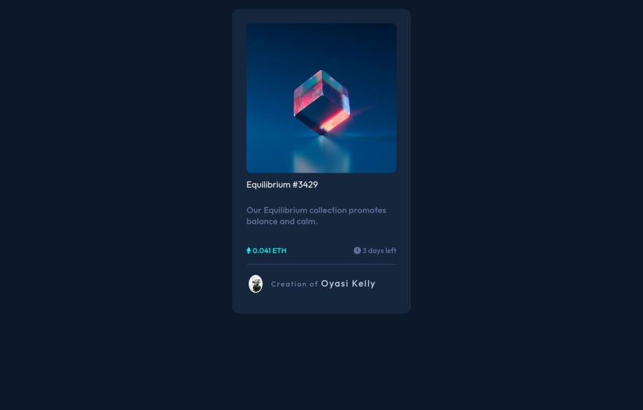
nft preview card component with css grid, flex blur image hovering, ..
Design comparison
Solution retrospective
I had difficulty trying to hover the image using the overlay <div> , but I managed to do that. I also tried to make it responsive without using media-query, but if there's anything you observe concerning the responsiveness or any other aspect of my code, please feel free to correct me.
Community feedback
- @PhoenixDev22Posted over 2 years ago
Hello Oyasi Kelly Ogheneoghagha,
Congratulation on completing this challenge. I have few suggestions regarding your solution, if you don't mind:
HTML
- Page should contain a level-one heading. For future use , use the headers in a chronological order. How you order headings dictates how a screen reader will navigate through them. As you go down a level, the number should increase by one, like a numbered list within an outline. In this challenge , as it’s not a whole page, you can have
<h1>to wrap theEquilibrium #3429.
- Never use
<div>and<span>alone to wrap a meaningful content. Just keep in mind that you should usually use semantic HTML in place of the div tag unless none of them (the semantic tags) really match the content to group together. By adding semantic tags to your document, you provide additional information about the document, which aids in communication.
- Since there's a :hover state on the image and means it's interactive, So there should be an interactive element around it. When you create a component that could be interacted with a user , always remember to include interactive elements like(button, textarea,input, ..)
for this imagine what would happen when you click on the image, there are two possible ways:
1: If clicking the image would show a popup where the user can see the full NFT, here you use<button>. 2:If clicking the image would navigate the user to another page to see the NFT, here you can use<a>.
For the same reason , you can use
<a>to wrapEquilibrium #3429.- The link wrapping the equilibrium image should either have
Sr-onlytext, anaria-labeloralttext that says where that link takes you.
- If your icons are purely decorative, you'll need to manually add an
aria-hiddenattribute to each of your icons so they're accessible.
- You have used <br> , using <br> is not only bad practice, it is problematic for people who navigate with the aid of screen reading technology. Screen readers may announce the presence of the element. This can be a confusing and frustrating experience for the person using the screen reader. You can read more in MDN If you widh to limit the width of the paragraph you may use max-width to <p>.
- If you wish to draw a horizontal line, you should do so using appropriate CSS. You may remove the
<hr>, you can useborder-top:to the avatar's part.
*To use more semantic tags , you may use
<figure>and<figcaption>for the avatar's part.- The alternate text of the avatar image should not be empty. You can use the creator's name
Jules Wyvern. Read more how to write an alt text
- For middle part of the card , you can use an unordered list
<ul>, in each<li>there should be<i>and<p>that way you can align them centrally.
There are so many ways to do the hover effect on the image, The one I would use is pseudo elements
::before, ::after. You can use pseudo-elements to change the teal background color to hsla. Then the opacity can be changed from 0 to 1 on the pseudo element on the hover. Also using pseudo elements makes your HTML more cleaner as there's no need for extra clutter in the HTML. The icon view does not really need to be in the HTML, yo may use CSS for it.Aside these, Great work! Hopefully this feedback helps.
Marked as helpful0@OyasikellyPosted over 2 years ago@PhoenixDev22 Thank you very much. I will work on these. I really appreciate your response.
1@PhoenixDev22Posted over 2 years ago@Oyasikelly You’re welcome and glad it was helpful .
0 - Page should contain a level-one heading. For future use , use the headers in a chronological order. How you order headings dictates how a screen reader will navigate through them. As you go down a level, the number should increase by one, like a numbered list within an outline. In this challenge , as it’s not a whole page, you can have
Please log in to post a comment
Log in with GitHubJoin our Discord community
Join thousands of Frontend Mentor community members taking the challenges, sharing resources, helping each other, and chatting about all things front-end!
Join our Discord
